


Open your course website on your own phone right now. Not on your laptop — on the phone in your pocket, with the office wifi switched off so you’re on mobile data like most of your visitors. Now try to actually buy your own course. Find the price, tap “enrol”, get to the payment screen with your thumb.
If that felt even slightly fiddly, you’ve just watched a sale slip away. Most of the people who discover your course will do exactly what you just did: land on a small screen, size it up in a few seconds, and either tap through with one thumb or quietly leave. When your site only really behaves on the big monitor where you built it, you lose sales you never even see in your stats. The reassuring part is that a mobile-friendly course website is mostly a short list of fixable things, not a ground-up redesign — and this is a walk through exactly which things.
Why does mobile matter so much for a course website?
Because more than half the world now browses on a phone, and your students are no exception. StatCounter has put smartphones at over half of global web page views right through 2026, hovering near 60% in some months — and that’s before you count tablets. For a course creator that number is often higher, because people research “should I take this course” in exactly the spare moments phones are made for: the commute, the sofa, the ten minutes before a meeting.
So the phone isn’t the second screen you check after the desktop is perfect. For a lot of your audience it’s the only screen. It’s where they first meet you, read your sales page, watch your trailer, and — this is the one that pays your bills — reach for their card. A site that’s merely “readable” on mobile isn’t enough when the whole decision to enrol happens there.
How can you tell if your course website is mobile-friendly?
The fastest honest test is the one you just did: use your own site on a real phone, on mobile data, and try to complete the thing you actually want visitors to do. Reviews and green dashboard ticks are useful, but nothing beats fumbling through your own checkout on a bus.
Do a proper pass rather than a glance. Read a full lesson description without pinching to zoom. Tap every important button — enrol, the menu, “play”, the FAQ toggles — and notice any you have to aim at carefully. Fill in the sign-up form with one hand. Watch how long the page takes to appear when you’re not on fast wifi. If your family has an older or cheaper Android phone lying around, borrow it; the site that flies on your new handset can crawl on a three-year-old one.
For a more systematic look, most browsers let you preview different screen sizes (Chrome’s device toolbar, Safari’s responsive design mode), which is handy for spotting layout breaks quickly. Treat it as a first sweep, though — the emulator shows you the layout, but only a real phone shows you the feel: the thumb stretch, the load time, the moment a popup traps you. Good navigation carries a huge amount of that weight, and it’s worth reading up on why clear course-website navigation matters before you start moving menus around.
What actually makes a course site hard to use on a phone?
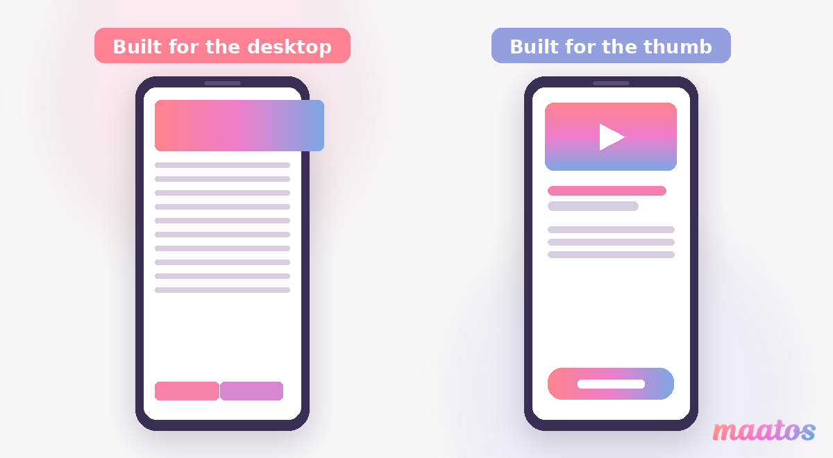
Nearly always it’s the same handful of culprits, and once you know them you’ll spot them everywhere. Tap targets that are too small or crammed together, so you keep hitting the wrong link. Body text set for a desktop, forcing readers to zoom in and then scroll sideways. Images and embedded videos that spill past the edge of the screen or refuse to shrink. Pop-ups and cookie banners with a close button you can’t reach or even see. Pages that take an age to load on mobile data because they’re hauling in huge images built for a 27-inch monitor. And, most costly of all, a checkout that fights your thumb — tiny fields, a card form that won’t autofill, an account you’re forced to create before you’re allowed to pay.
None of these are exotic. They’re the default state of a website that was designed and tested on a laptop and never truly used on a phone. The fix is almost always to simplify: one column instead of three, bigger type, fewer things competing for the tap.
How big should your buttons and text be on a phone?
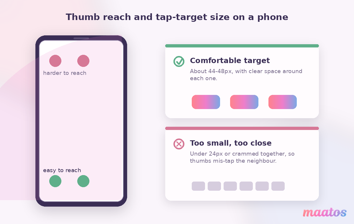
Big enough to tap confidently without looking, and big enough to read without zooming. The people who make the phones have actually published numbers for this, and they’re worth borrowing. Apple’s guidelines recommend a tap target of at least 44 by 44 points; Google’s Material Design suggests 48 by 48 density-independent pixels. The accessibility standard (WCAG 2.5.8) sets a floor of 24 by 24 CSS pixels at minimum, with its stricter level asking for 44 — so treat something in the 44–48px range as the comfortable target and leave a little breathing room around each one so thumbs don’t stray onto the neighbour.
Text follows the same spirit. A body size around 16px or more usually reads cleanly on a phone without anyone reaching for the zoom, and enough contrast between text and background keeps it legible in bright sunlight on a train platform. If a student has to squint or pinch, that’s friction — and friction on the way to “enrol” is expensive. When you’re setting up the look of your pages, it’s worth baking these sizes in from the start rather than shrinking a desktop design to fit; our guide to designing a course-website homepage is a good place to think about layout and hierarchy on the small screen too.
Does mobile-friendliness affect your Google ranking?
Yes — quite directly. Google predominantly uses the mobile version of your pages to decide how you rank, so if your mobile site is thin, slow or awkward, that’s the version being judged even for people searching on a desktop. A course page that reads beautifully on your laptop but stumbles on a phone is handing Google the worse impression of the two.
Speed is part of the same story. Phones on patchy mobile connections are far less forgiving than your office broadband, and a page that keeps visitors waiting loses them before it has a chance to sell anything. Compressing your images, not auto-playing heavy video, and keeping pages lean all help here. It’s genuinely two wins in one job: the same changes that make the site pleasant to use on a phone also make it easier to find, which is why it pairs so well with the fundamentals in our SEO basics for course websites.
Will people really buy a course on their phone?
They already are — but only when you let them. Mobile checkout is where good intentions go to die, so it deserves the most attention of anything on this list. Keep the payment form short and ask only for what you truly need. Let the browser autofill card and address details instead of making people type them one-handed. And offer the wallets people already have set up: paying with Apple Pay or Google Pay turns a fiddly form into a fingerprint or a glance, which is exactly the kind of friction you want to remove at the final step.
This is one place where the platform underneath you does real work. On Maatos, payments run through Stripe and Mollie, so students can pay by card, Apple Pay, Google Pay and a range of local methods depending on their country — the Maatos features page has the full picture, and it’s worth checking your own checkout against it. Whatever you build on, don’t force account creation before payment, and test the whole flow on a phone the way a stranger would. If you want to squeeze more out of that final screen, we’ve collected the quick wins for a course checkout separately.
A mobile pass you can do this afternoon
You don’t need a developer or a redesign to make real progress today — you need one uninterrupted hour, your phone, and a willingness to be honest about what annoys you. Work through your site the way a first-time visitor would and fix the friction as you find it.
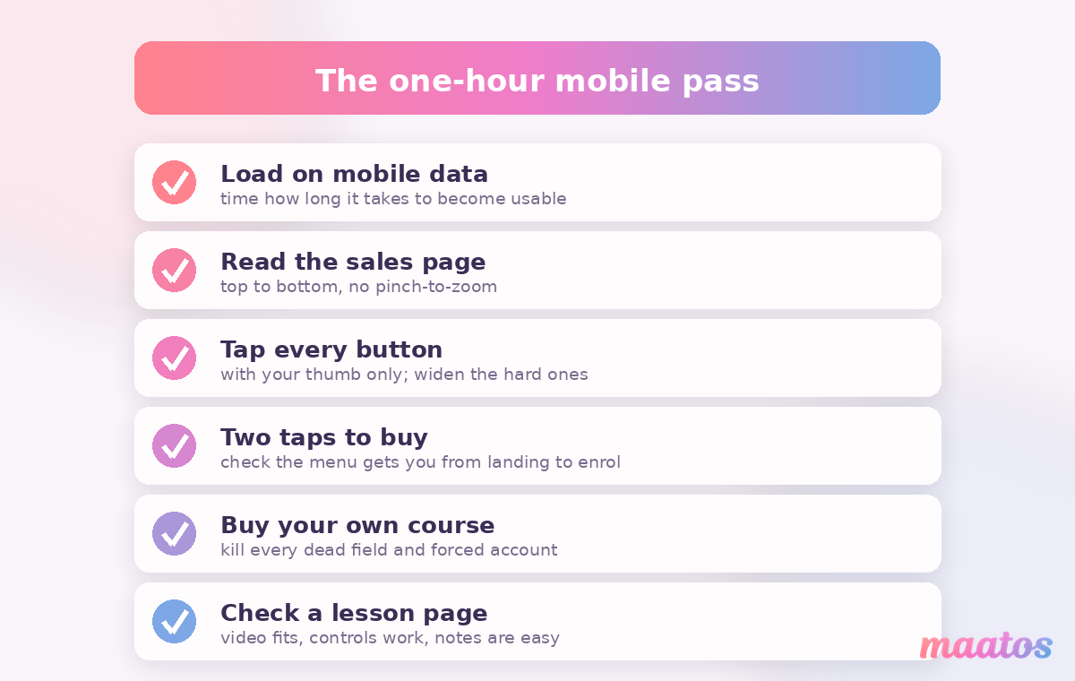
Start on your homepage on mobile data and time how long it takes to become usable. Read your best sales page top to bottom without zooming, and shrink or reformat anything you had to pinch. Tap every button and link with your thumb; widen and space out any that are hard to hit. Open your menu and make sure someone can get from “just landed” to “ready to buy” in a couple of taps. Then buy your own course — all the way to the payment screen — and remove every needless field, every forced account, every step you didn’t enjoy. Finish by checking a lesson page itself: does the video fit, do the controls work, can a student make notes comfortably one-handed?
Keep a short list as you go. Most creators find five or six specific fixes, not fifty, and knocking them out is the difference between a site that technically works on mobile and one that actually sells on it.
If, after that hour, the honest answer is “this needs more than tweaks”, that’s a perfectly reasonable place to land — and it’s exactly what our done-for-you service is for: we design and set up a professional, well-structured course website so you can put your energy into teaching instead of chasing layout bugs. Either way, the goal is the same — a site that treats the phone as the main event, because for most of your students it is. You’ll find more guides like this in the Build Course Website hub, and if you’d rather build it yourself, designing a branded course site without a designer is a friendly next read.
Frequently asked questions
What does “mobile-friendly” actually mean for a course website?
It means your site is genuinely usable and pleasant on a phone, not just technically viewable. In practice that’s readable text without zooming, buttons big enough to tap with a thumb (roughly 44–48px), images and video that fit the screen, fast loading on mobile data, and a checkout you can complete one-handed.
How do I test if my course site works on mobile?
Open it on a real phone using mobile data, not just your laptop, and complete the actions that matter: read a full sales page, tap every key button, and buy your own course all the way to the payment screen. Your browser’s device-preview mode is a useful first sweep for layout, but a real device is the only way to feel the load time and thumb reach.
How big should buttons be on a mobile course site?
Aim for tap targets of about 44–48 pixels with a little space around each one. Apple recommends at least 44×44 points and Google’s Material Design suggests 48×48, while the WCAG accessibility floor is 24×24 CSS pixels. Bigger, well-spaced buttons cut mis-taps and make enrolling easier.
Does having a mobile-friendly site help my Google ranking?
Yes. Google predominantly indexes and ranks the mobile version of your pages, so a weak mobile experience can hold you back even for desktop searchers. Speed matters too — the same fixes that make a site pleasant on a phone tend to help it rank.
Can students buy an online course on their phone?
Absolutely, and many prefer to — as long as checkout is easy. Keep forms short, allow autofill, offer wallets like Apple Pay and Google Pay, and never force account creation before payment. A platform such as Maatos handles card, Apple Pay, Google Pay and local methods through Stripe and Mollie.
Do I need a separate mobile app for my course?
Usually not. A well-built, responsive course website works on every phone without asking anyone to download anything, and it’s far less to maintain than a native app. Get the mobile web experience right first — for most course creators that’s all your students actually need.
Ready to see it for yourself? The quickest way to know your course looks and sells right on every screen is to build it and check it on your own phone — you can start free and have a mobile-ready course website up in an afternoon.