Course website navigation is a fundamental aspect of online course design. It defines how students interact with the course materials, activities, and resources. Poor navigation can lead to confusion, frustration, and disengagement. Clear and intuitive navigation helps students focus on learning rather than struggling to find what they need.
Effective course website navigation enhances the student experience by reducing cognitive load and providing easy access to content. When students know exactly where to go and how to move through the course, their motivation increases, leading to better learning outcomes. Navigation that reflects the course structure supports learners in tracking their progress and managing their time efficiently.
Key elements that contribute to effective course website navigation include:
- Clear and consistent layout: Fixed positions for menus and uniform labeling reduce confusion.
- Simplified menus: Logical organization of content by weeks or modules helps students find materials quickly.
- Accessibility: Features like alt-text for images and captions for videos ensure all learners can engage with content.
- LMS optimization: Including essential links such as Announcements, Grades, and Modules while disabling distractions improves focus.
- Orientation support: Early guidance on navigation reduces initial barriers for new learners.
- Flexible design: Navigation that adapts as the course evolves prevents clutter and maintains usability.
- Tool integration: Seamless access to external tools like Google Drive or publisher platforms streamlines workflow.
Understanding these components gives educators a clear roadmap for creating course websites that prioritize student needs and promote an engaging online learning environment. For those looking to start their journey in online education, Maatos offers valuable resources. Their services are designed to enhance your online teaching experience, while their course pricing models are tailored to convert potential students into enrolled ones. Should you have any inquiries or need further assistance, don’t hesitate to reach out through their contact page.
1. Clear and Consistent Layout: The Foundation of Effective Navigation
A clear layout is the backbone of any course website navigation system. When students access an online course, they expect to find information quickly without having to guess where to go next. Confusion caused by a cluttered or inconsistent layout can distract learners and reduce their focus on the material itself.
Consistent navigation helps eliminate this confusion by providing a stable framework throughout the course. Keeping navigation elements—such as menus, buttons, and links—in fixed positions across all pages allows students to build familiarity with the site’s structure. For example:
- Place the main navigation bar at the top or side of every page.
- Use uniform labels like “Modules,” “Assignments,” or “Resources” that don’t change from page to page.
- Avoid renaming sections mid-course, which can disorient users.
Fixed position links ensure that essential navigation tools remain visible regardless of scrolling or page changes. This reliability lets students move confidently through the course without hunting for navigation controls.
Clear and consistent labeling also reduces cognitive load. Using straightforward action verbs such as “View,” “Submit,” or “Download” immediately communicates what clicking a link will do. Icons paired with text labels can reinforce meaning but should never replace clear wording.
Incorporating progress markers elevates the learning experience by showing students how far they have come and what remains ahead. These markers might include:
- Percentage bars indicating completion of modules.
- Checkmarks appearing next to finished lessons.
- Visual timelines highlighting current position in the course flow.
Progress indicators serve two key purposes: they motivate learners by making achievements visible and provide real-time feedback on their advancement. This feedback loop encourages persistence and helps prevent feelings of being overwhelmed by large amounts of content.
Course designers should apply these principles rigorously to create a seamless interface where students spend less time navigating and more time engaging with learning materials. A clear and consistent layout is not just aesthetic—it’s essential for effective online teaching environments.
To streamline this process, leveraging services like Maatos’s done-for-you service can be beneficial. They offer tailored solutions that can significantly enhance the user experience by implementing these best practices efficiently. Furthermore, understanding pricing options for such services can help in making informed decisions about budget allocation for course design improvements.
2. Simplifying Navigation for Enhanced Usability
Simplification plays a crucial role in making course websites user-friendly. When navigation menus become overloaded with too many options or cluttered visuals, students can feel overwhelmed and distracted from their learning objectives. You want to keep navigation menus streamlined and focused, presenting only what’s necessary to guide students efficiently through the course.
Key strategies for simplification include:
- Reducing visual clutter: Minimize excessive buttons, links, or graphics that do not contribute directly to navigating course content. Use whitespace strategically to separate sections and make important elements stand out.
- Logical content organization: Structure course materials into clear, manageable units such as weekly segments or thematic modules. This approach aligns with how learners typically process information and helps them locate resources quickly.
- Consistent module structure: Each module should follow a predictable pattern—introduction, learning activities, assessments, and additional resources. Consistency here reduces cognitive load by setting clear expectations each time students access new material.
- Focused homepage design: The homepage serves as the gateway to the entire course. Present only relevant announcements, deadlines, or essential links here. Avoid overcrowding it with non-essential information that can distract or confuse learners.
By simplifying navigation menus and organizing content logically, you enable students to focus on learning instead of figuring out how to move around the site. A clean interface paired with a well-thought-out module structure acts like a roadmap that guides learners smoothly through their educational journey without unnecessary detours or distractions.
3. Ensuring Accessibility and Usability Across Diverse Learner Needs
Accessibility standards are essential for designing course website navigation that works for every student, regardless of their abilities or disabilities. Meeting these standards is not just a legal requirement but a practical necessity to ensure all learners can engage fully with the course materials.
Key accessibility requirements include:
- Alt-text for images: Every image on your course website should have descriptive alt-text. This allows screen readers to convey the content or function of images to visually impaired students. Alt-text should be concise yet informative, describing the purpose of the image rather than its appearance alone.
- Captions for videos: Videos must include captions or subtitles. This supports learners who are deaf or hard of hearing and benefits those in noisy environments or non-native speakers who rely on text to understand spoken content.
- Clear link labeling: Links should use descriptive text instead of vague phrases like “click here.” Clear labels indicate the destination or action, improving navigation clarity for screen reader users and everyone else.
Thorough testing of all links and navigation paths is equally critical. Broken links or confusing navigation disrupt the user experience and create barriers that can frustrate learners or block access entirely. Use tools such as automated link checkers combined with manual testing in various browsers and devices.
Simulate different user experiences by employing features like “Student View” in your Learning Management System (LMS) to identify and fix navigation issues before students encounter them. Testing should also include keyboard-only navigation to ensure users who cannot operate a mouse can still move through the course seamlessly.
By prioritizing accessibility standards and rigorous link testing, you build a course website navigation system that accommodates diverse learner needs, creating an inclusive educational environment where all students can focus on learning without unnecessary obstacles.
4. Optimizing Navigation Elements Within Learning Management Systems (LMS)
Learning Management Systems (LMS) are the backbone of many online courses. Their navigation setup can either streamline student engagement or create unnecessary complexity. Following LMS navigation best practices helps you design an environment where students focus on learning, not on figuring out how to access resources.
Essential Links in LMS Courses
Certain links and sections should always be visible and easy to find within your course LMS interface:
- Announcements: Keeps students updated with important course news, deadlines, and changes.
- Grades: Allows learners to quickly check their performance and track progress.
- Modules: Organizes course content logically by weeks, units, or topics for easy access.
- Library Resources: Directs students to essential research materials and academic databases.
- Syllabus: Provides a roadmap for the course structure, expectations, and policies.
- People/Contacts: Lists instructors and teaching assistants for prompt communication.
- Discussions (when relevant): Facilitates peer interaction and collaboration when actively used.
These links serve as navigational pillars that guide students through the core components of the course. Clear labeling with descriptive titles—such as “Course Modules” instead of just “Modules”—can also improve clarity.
Reducing Distractions by Disabling Less Useful Features
Many LMS platforms include a wide array of tools by default, but not all are necessary or helpful in every course context. Reducing clutter sharpens student focus. Consider disabling features that create redundancy or confusion:
- Assignments if all assignments are accessible through Modules.
- Attendance tracking unless actively used.
- Chat or Collaborations if other communication channels are preferred.
- Files or Pages when all resources are organized within Modules or Library links.
- Zoom links if video conferencing is scheduled externally or centralized elsewhere.
- Outcomes or Quizzes tabs if redundant with module-based assessments.
Removing redundant links prevents confusion and reduces cognitive load. It makes navigation intuitive by limiting choices to only what’s relevant.
Customizing Navigation for Different Course Types
Not all courses have the same navigation needs. Tailoring LMS navigation components to fit your course type enhances usability for your specific learner group:
- Self-paced courses benefit from a simple menu focused on Modules and Grades.
- Instructor-led courses might emphasize Announcements and Discussion boards.
- Research-intensive classes require prominent Library resource links.
Using LMS Settings for Navigation Control
Most LMS platforms allow you to reorder menu items and customize visibility settings. Take advantage of these options to create a seamless digital learning environment:
- Place critical links at the top or in fixed positions so they remain visible during scrolling.
- Use icons alongside text labels when supported; this aids quick recognition without clutter.
- Enable breadcrumb trails so students always know their location within the course hierarchy.
Optimized LMS navigation creates a seamless digital learning environment where essential resources are never more than a click away.
5. Providing Orientation Support to New Learners Through Effective Navigation Design
New learners often face an initial challenge when entering an online course environment. A navigation system designed with orientation support strategies in mind can significantly reduce confusion and help students start their learning journey confidently.
Key components of orientation support through navigation include:
-
Clear Introduction to Navigation Elements
Presenting an explicit overview of the main navigation features right at the start helps students understand where to find essential resources. This can be achieved through welcome messages, guided tours, or short tutorial videos embedded within the course homepage. -
Highlighting Critical Links and Sections
Using visual cues such as icons, bold labels, or color highlights draws attention to crucial areas like Announcements, Syllabus, and Modules. This guidance directs new learners toward necessary information and activities without overwhelming them with options. -
Step-by-Step Onboarding Paths
Structuring the first module or week as a dedicated orientation segment familiarizes students with site layout and key processes (e.g., submitting assignments, participating in discussions). This reduces uncertainty about course mechanics early on. -
Interactive Walkthroughs
Incorporating interactive elements that prompt learners to explore specific parts of the navigation interface reinforces knowledge retention. For example, clickable hotspots or pop-up tips can guide users through completing initial tasks or locating support resources. -
Accessible Support Channels
Easy access to FAQs, contact information for instructors or technical support, and community forums within the navigation framework ensures students receive timely assistance as they acclimate to the online environment.
By embedding these orientation support strategies into your course website navigation, you create a welcoming experience that lowers barriers for new learners. Clear guidance from the beginning encourages engagement and builds confidence in navigating course materials efficiently.
6. Designing Flexible Navigation Systems That Adapt Over Time
Creating course website navigation that remains effective requires flexible navigation design principles. Courses evolve—content updates, new modules get added, and teaching strategies shift. Your navigation system must adapt without confusing students or forcing a steep relearning curve.
Key considerations for flexible navigation design:
-
Modular structure: Organize content into discrete units like weeks, topics, or modules. This allows you to add, remove, or rearrange sections without disrupting the entire navigation framework. For example, if an extra module is introduced mid-semester, students can easily find it in the same logical place as previous modules.
-
Consistent labeling with room for growth: Use clear, descriptive labels for navigation links but avoid overly specific terms that might become outdated. Instead of naming a section “Week 1: Introduction to Economics,” use “Module 1: Foundations.” This keeps labels relevant even if content shifts slightly.
-
Expandable menus and dropdowns: Employ menus that can expand or collapse based on current course structure. This supports adding new items while maintaining a clean interface. Students won’t feel overwhelmed by options they don’t need yet.
-
Version control and archiving: When updating course materials or reorganizing content, keep older versions accessible but clearly marked as archived. This prevents broken links or missing pages while allowing students to reference prior content if necessary.
-
Centralized dashboard approach: Design a homepage or dashboard where all key resources link from one place. Even if individual modules change, this core hub remains stable, helping students orient themselves quickly.
-
Visual cues for changes: Highlight new or updated sections with badges like “New” or color indicators. This guides learners through evolving content without requiring extensive explanation each time.
Adopting these practices ensures your course website navigation supports both current needs and future adjustments smoothly. Students encounter fewer surprises navigating the site as courses grow more complex or pivot during the term.
Flexible navigation design principles keep the learning experience seamless by balancing stability with adaptability. You maintain clarity while accommodating continuous improvements in your course delivery and materials.
7. Integrating Essential Tools Seamlessly into Course Website Navigation
In online courses, integrated tools play a crucial role in delivering content, facilitating communication, and supporting learning activities. Embedding these tools directly within the course navigation structure creates a smoother experience for students, reducing the need to switch between multiple platforms or struggle to find resources.
Common integrated tools in online courses include:
- Google Drive and Cloud Storage: Easy access to shared documents, spreadsheets, slide decks, and collaborative assignments is vital. Embedding Google Drive links or folders into the navigation menu allows students to quickly retrieve materials without searching through email or external sites.
- Publisher Platforms: Many courses rely on digital textbooks and interactive resources from providers like Cengage MindTap, McGraw-Hill Connect, or Pearson MyLab. Including direct access points to these platforms in the navigation ensures students can transition seamlessly between course content and publisher resources.
- Response Systems: Tools such as iClicker or Poll Everywhere enhance engagement through live polls, quizzes, and interactive questions. Integrating these links into the main navigation helps students locate participation activities easily during synchronous sessions or self-paced modules.
- Secure Testing Environments: LockDown Browser and other proctoring software often require separate logins or downloads. Providing clear, dedicated navigation buttons reduces confusion around accessing secure assessments and minimizes technical issues.
- Media Galleries: Video lectures, podcasts, and image libraries should be organized within the course site’s navigation rather than scattered across external platforms. This centralization supports consistent access and helps maintain focus within the learning environment.
- Remote Proctoring Services: For courses with online exams requiring identity verification or monitoring, linking directly to services like ProctorU through the navigation saves time and clarifies expectations for students.
To integrate these tools effectively:
- Use clearly labeled menu items that describe the tool’s function (e.g., “Lecture Slides,” “Interactive Textbook,” “Polls & Quizzes”).
- Position essential tool links prominently but avoid overcrowding the main menu; consider nested menus or dropdowns for less frequently used resources.
- Ensure single sign-on (SSO) options are enabled where possible to reduce login friction between systems.
A thoughtfully integrated navigation system that incorporates essential tools not only enhances usability but also fosters engagement by keeping all vital resources within easy reach. This approach aligns with learners’ needs for streamlined access and reduces cognitive load caused by navigating disparate systems.
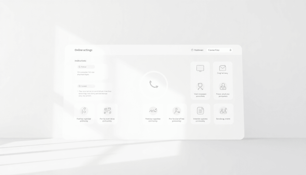
How Maatos Supports Effective Course Website Navigation Through Its Platform Features?
Maatos is a platform built with educators in mind, focusing on delivering user-friendly branded course websites that prioritize intuitive navigation. It addresses many challenges faced when designing course sites by offering tools and features tailored to simplify the student experience while maintaining flexibility for instructors.
Key Maatos platform benefits include:
- Customizable Navigation Menus: You can create clear, consistent menus that align with your course structure. Maatos allows fixed positioning of navigation elements so students always know where to find essential links.
- Branded Course Sites: The platform supports branding elements such as logos and color schemes. This customization helps maintain a professional look without sacrificing usability or clarity in navigation.
- Centralized Resource Access: All critical course materials—modules, assignments, announcements, and integrated tools like Google Drive or publisher platforms—can be linked within one streamlined menu. This reduces clutter and keeps students focused.
- Progress Tracking Integration: Maatos supports incorporating progress markers directly into the navigation interface. This feature gives students immediate feedback on their advancement through the course content.
- Responsive Design for Accessibility: The platform ensures that navigation remains functional and accessible across devices and screen sizes. Accessibility considerations are built into the design to support diverse learner needs.
- Simplified LMS Compatibility: When used alongside popular LMSs, Maatos complements existing systems by enhancing navigation without overwhelming students with redundant features.
By focusing on these aspects, Maatos helps you build course websites that reduce cognitive load, improve ease of use, and foster a positive learning environment through well-designed navigation paths.
Conclusion
User-friendly navigation in online courses is crucial for effective learning experiences. By investing time and effort into designing clear, consistent, and accessible course website navigation, you directly enhance student engagement and reduce frustration. This allows learners to focus on course content instead of struggling to find it.
Key reasons to prioritize course website navigation include:
- Improved student satisfaction: Intuitive navigation encourages continuous participation.
- Increased learning efficiency: Easy access to materials supports better study habits.
- Reduced cognitive load: Clear pathways lower confusion and help students focus.
- Inclusive learning environments: Accessibility ensures all students can navigate comfortably.
Creating a positive learning environment depends on how easily students can interact with your course platform. Thoughtful navigation design is not just a technical detail—it’s an essential part of teaching strategy that shapes the entire online learning journey.
You have the power to transform your courses by making navigation a priority. Simple, logical, and accessible course website navigation benefits everyone involved—educators and learners alike.