Visual design in the context of online courses refers to the strategic use of visual elements—such as color, typography, layout, and imagery—to enhance the presentation and usability of eLearning content. It shapes how learners perceive and interact with course materials, making information more accessible and engaging.
The impact of online course visual design on learner engagement and comprehension is significant. Well-designed visuals guide attention, reduce cognitive load, and support memory retention by organizing information clearly. Research shows that learners retain up to 80% of information presented visually compared to only 20% from text alone. This underscores the critical role visual design principles play in creating effective eLearning experiences.
It’s important to distinguish visual design from instructional design. Instructional design focuses on defining learning objectives, structuring content logically, and selecting appropriate teaching methods. Visual design complements this by focusing on how content looks and feels to the learner. Both disciplines must work together; strong instructional plans can falter without intuitive navigation or clear visuals, just as attractive visuals may fail if course goals are unclear.
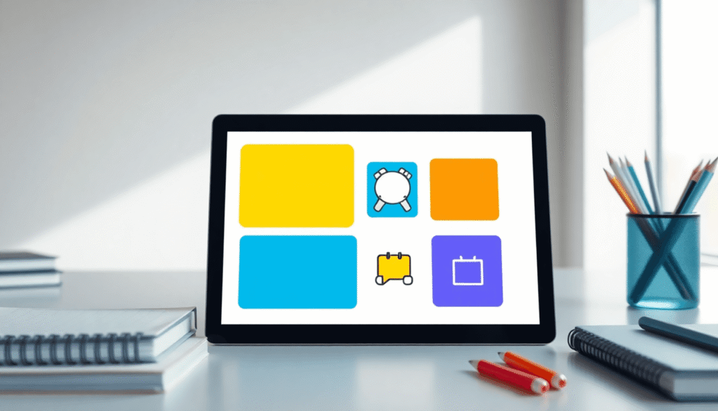
Platforms like Maatos exemplify tools that integrate these needs by offering drag-and-drop course creation combined with visual customization options. Maatos supports creators in applying fundamental visual design principles without requiring advanced graphic skills, enhancing both eLearning usability and aesthetic appeal.
Effective online course visual design bridges the gap between instructional intent and learner experience, making education not just informative but visually intuitive.
For those looking for a more tailored approach to online course creation, services like Maatos’s done-for-you service can provide valuable assistance. Additionally, platforms such as Uthena and Soofos offer unique solutions in the realm of online learning.
Understanding Basic Visual Design Principles Relevant to Learning
Visual design principles are essential for creating effective online learning visuals. These principles, known as C.R.A.P.—Contrast, Repetition, Alignment, and Proximity—are crucial in designing an engaging and user-friendly learning experience. By applying these principles, you can improve readability, emphasize important information, and help learners focus on the content, making it easier for them to understand and remember.
Contrast: Highlighting Key Information
Contrast is vital in directing learners’ attention to the most significant parts of your course. It creates visual emphasis by making certain elements stand out from their surroundings.
- Draws attention to calls-to-action: Buttons, navigation links, and interactive components benefit from strong contrast to ensure learners immediately recognize them as actionable items.
- Improves legibility: Using color contrast between text and background improves readability, reducing eye strain and cognitive effort. For example, dark text on a light background or vice versa works well.
- Typography contrast: Varying font sizes, weights (bold vs. regular), and styles can highlight headings or key terms without overwhelming the learner.
Effective contrast involves not only color but also differences in shape, size, texture, and spacing that help clearly distinguish elements. In eLearning contexts, consider:
- Button colors: Bright colors like orange or green on neutral backgrounds signal clickable actions.
- Text hierarchy: Larger font sizes for headings contrasted with smaller body text guide learners through content logically.
- Background variation: Using subtle background shades can separate sections without cluttering the page.
Applying contrast strategically increases engagement by focusing learner attention where it matters most—on crucial instructions, questions, or next steps.
Consistency through Repetition and Alignment
Consistency is crucial for effective online course visual design. It is one of the foundational C.R.A.P principles—alongside Contrast, Alignment, and Proximity—that guides the creation of cohesive and user-friendly learning visuals. In eLearning, consistency primarily emerges through repetition and alignment, both working together to enhance usability and learner comprehension.
Repetition: Building Visual Cohesion
Repetition involves repeating certain design elements such as colors, fonts, shapes, or layout styles across multiple course pages and modules. This repetition creates a unified aesthetic that helps learners recognize patterns and navigate content more intuitively. For example:
- Using the same header font style and size on every slide or page.
- Employing consistent button shapes and colors for calls-to-action throughout the course.
- Repeating background textures or iconography to reinforce branding subtly without overwhelming learners.
This visual consistency reduces cognitive load by allowing learners to focus on the material rather than deciphering new layouts or style changes with every screen. When design elements repeat predictably, learners develop familiarity that supports faster information processing.
“Repetition is not redundancy; it is a powerful tool to create harmony in your course’s visual language.”
Repeated use of key colors or fonts also strengthens visual emphasis where needed while maintaining readability. Without repetition, content risks appearing disjointed or chaotic, which can distract learners and undermine engagement.
Alignment: Organizing Content Neatly
Alignment refers to arranging text blocks, images, buttons, and other elements along common edges or axes—vertically or horizontally—to create order on each page. Proper alignment offers several benefits:
- Establishes clean lines that guide the learner’s eye naturally across the content.
- Avoids random placement that causes visual clutter.
- Helps group related items logically by aligning them in rows or columns.
For instance, left-aligning all paragraph text maintains a stable reading flow since most learners read left to right. Center-aligning headings on each page can provide a balanced focal point without inconsistency. Aligning interactive elements like quiz questions and answer choices uniformly also makes navigation intuitive.
Alignment plays a key role in lowering cognitive effort by presenting information in predictable locations. When students do not have to hunt for essentials like navigation menus or progress indicators, they can engage more deeply with learning materials.
Incorporating repetition and alignment systematically across your online course visuals ensures an organized experience that supports better retention. These visual design principles emphasize clarity over decorative complexity—prioritizing learner needs above branding alone. Applying consistency through these methods complements contrast techniques by delivering a polished interface where important information stands out within an orderly frame.
Proximity: Grouping Related Content for Clarity
The proximity principle is a core part of the C.R.A.P visual design framework, essential for creating clear and effective online learning visuals. It involves placing related items close to each other to form a visual connection. This simple technique helps learners quickly recognize which elements belong together, improving content comprehension and navigation.
Applying proximity means grouping:
- Text with corresponding images: When descriptive text sits near its related image, learners can immediately associate the two without confusion. For example, a diagram paired closely with explanatory bullet points aids in reinforcing concepts.
- Labels with input fields: Forms or quizzes become easier to complete when labels are positioned directly adjacent to their respective input boxes, reducing errors and cognitive load.
- Headings with supporting details: Keeping headings close to their paragraphs allows learners to scan sections faster and understand the information hierarchy naturally.
Proximity supports faster scanning by visually organizing content into manageable chunks. Learners do not have to hunt for connections or guess relationships between scattered pieces of information. Instead, their eyes flow smoothly through logically grouped elements, enhancing retention and reducing frustration.
In practice, proximity works hand-in-hand with contrast and alignment. While contrast highlights key elements and alignment ensures neat structure, proximity clarifies the relationships between those elements. Together these principles elevate usability and learner comprehension beyond mere aesthetics or strict branding adherence.
Focusing on proximity also benefits mobile learning environments where screen space is limited. Efficient grouping prevents clutter and keeps essential information accessible without overwhelming the learner.
When designing your course visuals, consider spacing carefully:
- Avoid isolating related items by excessive gaps.
- Use white space intentionally between groups to separate concepts clearly.
- Combine proximity with consistent typography and color schemes for a cohesive look that guides learners effortlessly through the material.
By mastering this foundational visual design principle, you create online courses that feel intuitive and approachable—key factors that support meaningful engagement in digital learning experiences.
Prioritizing Usability Over Branding in Online Course Design
In the world of online courses, usability in eLearning is a crucial factor that directly impacts learner engagement and success. While branding is important for identity and recognition, strict adherence to branding guidelines should never overshadow the functional needs of learners. The primary goal remains clear: deliver content that is easy to understand, navigate, and interact with.
Why Usability Takes Priority
Branding often emphasizes visual consistency—specific colors, fonts, logos, and stylistic elements aligned with an organization’s image. However, when these elements interfere with readability or accessibility, they hinder learning rather than help it. For example:
- A branded color palette with low contrast can make text hard to read.
- Decorative fonts may look appealing but reduce legibility on various screen sizes.
- Complex navigation menus tied to brand style might confuse learners trying to find key content.
Functional design focuses on the learner’s experience first. It ensures every visual choice supports comprehension and ease of use rather than just meeting aesthetic criteria.
Usability-Focused Design Decisions
1. Font Choice
- Select fonts that are clear and easy to read on multiple devices.
- Sans-serif fonts like Arial, Helvetica, or Open Sans are popular for digital learning because they maintain legibility even at smaller sizes.
- Avoid overly decorative or script typefaces that strain the eyes during prolonged reading.
2. Color Accessibility
- Use color combinations that meet Web Content Accessibility Guidelines (WCAG) standards for contrast.
- Ensure text stands out sharply against backgrounds; this benefits not only learners with visual impairments but all users.
- Provide alternative cues besides color (such as icons or underlines) to convey important information for those with color blindness.
3. Intuitive Navigation
- Design straightforward menus and clear pathways through course modules.
- Use consistent placement of buttons and links so learners know where to look next without confusion.
- Incorporate progress indicators and breadcrumbs to orient users within the course flow.
By emphasizing learner-centered visuals, you create an environment where design choices support the educational mission above all else. This approach minimizes cognitive load—freeing learners to focus on absorbing material rather than deciphering how to access it.
The balance between branding and usability does not mean sacrificing identity entirely. Instead, it involves adapting brand elements thoughtfully so they enhance rather than obstruct the learning process. For instance, brand colors can be adjusted slightly for better contrast without losing their essence; logos can be scaled appropriately to avoid clutter; typography can reflect brand personality while prioritizing clarity.
Focusing on usability in eLearning creates a smoother path for learners, making your course not just visually pleasing but highly effective at achieving educational goals.
How Visuals Support Comprehension and Retention in Learning
Visuals play a critical role in enhancing learner comprehension and retention. Research consistently shows that people retain about 80% of information presented visually, compared to only 20% from reading text alone. This difference highlights the power of incorporating well-designed visuals in online course visual design.
Visuals and Multimedia Learning Theory
The multimedia learning theory emphasizes that learners process information better when content is delivered through both verbal and visual channels. Combining text with images, diagrams, or animations reduces cognitive overload by distributing the mental effort needed to understand complex concepts. For example:
- A diagram explaining a process can clarify steps more effectively than paragraphs of text.
- Infographics synthesize data into digestible, memorable formats.
- Icons act as visual cues that quickly communicate ideas without heavy reading.
This balanced use of visuals supports cognitive load reduction, allowing learners to focus on key messages rather than struggling to decode dense text.
Visual Hierarchy Guides Learners Effectively
Creating a clear visual hierarchy is essential for guiding learners through course material in a logical sequence. Visual hierarchy manipulates size, color, contrast, and placement to signal the importance of elements on a page. Key techniques include:
- Larger headings direct attention to main topics.
- Bold or colored text emphasizes critical points.
- Whitespace and spacing separate chunks of information for easier scanning.
- Step-by-step layouts help learners follow procedures without confusion.
A well-structured visual hierarchy reduces frustration by making navigation intuitive and content progression natural.
Simplifying Complex Concepts with Icons, Diagrams, and Infographics
Complex ideas often become barriers to understanding when presented only as text. Visual tools can break down complicated subjects into manageable parts:
- Icons serve as universal symbols that represent functions or categories instantly.
- Diagrams illustrate relationships, hierarchies, or cycles clearly (e.g., flowcharts or mind maps).
- Infographics combine data visualization with narrative storytelling to engage learners deeply.
These elements transform abstract or technical content into approachable formats, which supports faster comprehension and longer retention.
Using visuals strategically within your online courses leverages human cognitive strengths. By designing with these principles in mind, you improve not just how your content looks but how effectively it teaches.
Accessibility Considerations for Non-Designers Creating Course Visuals
Creating accessible design is essential for making your online course usable by all learners, including those with disabilities. You don’t need to be a design expert to apply key principles that support inclusive eLearning visuals and improve comprehension through clear hierarchy and usability.
Basic Accessibility Best Practices
- Color Contrast Ratios: Use color combinations that meet minimum contrast standards. For example, text should have at least a 4.5:1 contrast ratio against its background to ensure readability for users with visual impairments. Tools like the WebAIM Contrast Checker can help you verify this easily.
- Font Sizes and Readability: Choose fonts that are legible and set sizes large enough for comfortable reading on various devices. Avoid overly decorative fonts; stick to clean, sans-serif or serif fonts that maintain clarity at different scales.
- Alt-Text for Images: Provide descriptive alternative text for every meaningful image. Alt-text allows screen readers to convey the content of images to visually impaired learners. This simple step makes your visuals accessible without changing their appearance.
Practical Tips for Non-Designers
Non-designers often worry about balancing accessibility with aesthetics, but focusing on usability over branding ensures content is understandable first. Keep these tips in mind:
- Use simple layouts that do not overwhelm learners with unnecessary decoration.
- Group related elements logically using proximity to reduce cognitive load.
- Maintain consistent typography and spacing to reinforce visual hierarchy.
- Prioritize function before style in button colors, font choices, and navigation elements.
Tools and Resources That Simplify Accessible Visual Creation
Several platforms and tools cater specifically to creators who lack advanced design skills but want to produce accessible course visuals:
- Maatos Platform Features: The Maatos platform offers built-in accessibility checks including color contrast validation, font size presets, and easy alt-text fields during content upload. Its drag-and-drop builder encourages clean alignment and repetition without requiring graphic design experience.
- Canva Accessibility Features: Canva includes templates optimized for accessibility, such as high-contrast designs and readable fonts, along with guides on writing effective alt-text.
- WebAIM Contrast Checker: A free web tool letting you test foreground-background color pairs quickly.
- Accessible Typography Guides: Online resources explaining how to select fonts, line heights, and spacing to maximize readability for diverse audiences.
Applying these straightforward practices ensures your course visuals are not only attractive but also accessible and user-friendly. This foundation supports comprehension by making information easy to scan, read, and interact with—critical factors when learners come from varied backgrounds and abilities.
Integrating Visual Design with Course Creation Platforms Like Maatos
Maatos stands out as a course website builder designed to empower educators and creators who may not have formal graphic design training. Its drag-and-drop interface simplifies the integration of visual design principles directly into course development.
Drag-and-Drop Simplicity Meets Visual Design Principles
- No graphic design expertise required: Maatos allows you to apply fundamental concepts like contrast, alignment, repetition, and proximity through an intuitive editor. You can visually arrange elements, adjust colors, and select typography without dealing with complex software.
- Pre-built templates aligned with best practices: Templates offered by Maatos are crafted considering usability and accessibility. They provide a solid foundation that respects visual hierarchy and user-friendly layouts.
- Real-time visual feedback: As you build your course pages, immediate previews help you see how design adjustments affect learner experience.
Combining LMS Functionality with Visual Customization
- Seamless learning management system (LMS) features: Beyond just designing, Maatos integrates core LMS tools such as quizzes, progress tracking, and multimedia embedding. This combination ensures that your course is not only visually appealing but functionally robust.
- Customization without complexity: Adjust navigation menus, buttons, and interactive components easily while maintaining consistent branding and style. This eliminates the need for separate platforms or plugins.
- Responsive design baked in: Courses created on Maatos automatically adapt to different devices. This responsiveness supports learners accessing content from desktops, tablets, or smartphones without losing visual integrity.
Empowering Course Creators Through Maatos Features for Designers
- Visual customization tools tailored for non-designers: Options like color pickers with accessible palettes, font pairings optimized for readability, and spacing controls support effective design decisions effortlessly.
- Drag-and-drop media placement: Add images, videos, icons, and infographics precisely where they enhance comprehension and engagement.
- Consistent styling across modules: Global style settings enforce repetition and alignment principles across all course pages to create a cohesive learning environment.
Using platforms such as Maatos enables educators to focus on content quality while ensuring their courses meet high standards of visual clarity. This blend of LMS power and user-friendly design tools helps create online learning experiences that are both attractive and easy to navigate. Furthermore, understanding the course pricing models that convert can significantly enhance the monetization strategy of these online courses.
Conclusion
Applying fundamental visual design principles centered on usability is essential for creating effective online course design that truly enhances learning outcomes. When you focus on clarity, contrast, consistency, and accessibility, you make it easier for learners to engage with and retain information.
Key takeaways to keep in mind when you create better courses:
- Prioritize clarity and simplicity over complex visuals or strict branding rules. This reduces cognitive load and helps learners focus on the material.
- Ensure accessibility by using appropriate color contrast, readable fonts, and descriptive alt-text. Accessibility broadens your audience and improves the overall learning experience.
- Use visual hierarchy thoughtfully to guide learners step-by-step through content, reinforcing the visual learning impact of your course elements.
- Group related content logically, maintain alignment consistency, and apply repetition to build a cohesive and professional look.
Designing with these principles in mind empowers you to deliver courses that are not only attractive but also highly functional—supporting learner success.
If you’re ready to elevate your course visuals without needing advanced graphic design skills, platforms like Maatos offer intuitive tools that help you integrate sound visual design easily. Their drag-and-drop features combined with LMS capabilities make it straightforward to build visually optimized online courses tailored for engagement and comprehension.
Explore Maatos today and start crafting courses where strong visual design meets effective teaching practices—unlocking the full potential of your educational content.