Visual design is crucial in course website visual design and e-learning website design, directly impacting learner engagement and usability. A well-crafted interface does more than look appealing; it creates an environment where users can easily navigate content, absorb information, and stay motivated throughout their learning journey.
Good visual design supports learning by:
- Enhancing clarity and focus, helping learners quickly identify important course elements.
- Reducing cognitive load through organized layouts that prevent visual clutter.
- Encouraging interaction by making calls-to-action and navigation intuitive and inviting.
- Evoking positive emotional responses, which contribute to motivation and retention.
Understanding the basics of LMS design means recognizing how visual hierarchy, color choices, spacing, and balance work together to build a user-friendly experience. Each element contributes to a seamless journey from course discovery to completion.
Maatos stands out as a platform designed specifically for creators who want to build visually effective course websites without complex coding. It offers:
- Drag-and-drop tools tailored for educational content.
- Customizable templates that maintain branding consistency.
- Features focused on balancing aesthetic appeal with functional usability.
By empowering educators and creators with these capabilities, Maatos ensures your course website isn’t just a container for information — it becomes an engaging digital space where learners thrive. For those interested in leveraging this platform, additional information can be found on their pricing page. If you’re seeking personalized assistance in creating your course website, Maatos also offers a done-for-you service that simplifies the process. For any inquiries or further information, feel free to reach out via their contact page.
Core Principles of Visual Design for Course Websites
Designing an effective course website starts with mastering several core visual design principles. These principles help organize information, highlight important content, and create an inviting learning environment.
Scale: Signaling Importance
Scale refers to the size relationship between different elements on a page. Larger elements naturally draw more attention and suggest greater importance. For example:
- Course titles should be larger than module headings.
- Key buttons like Enroll Now or Start Quiz benefit from increased size to stand out.
Using up to three different sizes creates variety without overwhelming the learner. Scale acts as a visual cue, guiding users on what to focus on first.
Visual Hierarchy: Guiding Learners’ Attention
Visual hierarchy organizes content so learners can navigate through it intuitively. This hierarchy controls the order in which information is perceived by manipulating:
- Size: Larger text grabs attention before smaller details.
- Color: Bright or contrasting colors emphasize priority items.
- Spacing: More white space around elements signals separation and importance.
- Placement: Positioning key content above the fold ensures visibility.
A well-executed visual hierarchy prevents cognitive overload by presenting information in digestible chunks and logical flow.
Balance: Creating Harmony and Stability
Balance distributes visual weight evenly across the course page to avoid feelings of chaos or emptiness. Two types of balance are common:
- Symmetrical balance: Equal weight on both sides of an axis, offering a stable, formal look.
- Asymmetrical balance: Unequal but visually equivalent weights that create dynamic interest while maintaining harmony.
Balanced layouts feel inviting and professional, helping learners feel comfortable exploring course content.
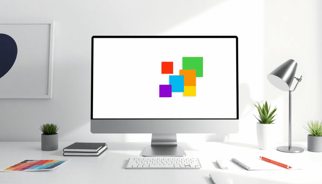
Contrast: Differentiating Key Elements
Contrast emphasizes differences between elements by juxtaposing distinct features such as color, size, shape, or texture. It highlights important components like:
- Calls-to-action (CTAs)
- Navigation menus
- Alerts or notifications
For example, a bright button against a muted background immediately catches the eye. Sufficient contrast also supports accessibility for users with visual impairments.
Gestalt Principles: Simplifying Complex Visuals
Gestalt psychology explains how people perceive visual components as whole forms rather than isolated parts. Applying these principles streamlines complex course visuals and improves comprehension through:
- Proximity: Group related items close together to indicate association.
- Similarity: Use consistent shapes or colors for related content blocks.
- Closure: Allow learners’ minds to fill in incomplete shapes or patterns.
- Continuation: Guide eyes along smooth paths through aligned elements.
- Common Region: Enclose related items within boundaries for clarity.
- Figure/Ground: Distinguish foreground content from background clearly.
- Symmetry and Order: Organize elements in balanced ways to reduce confusion.
Gestalt principles reduce mental effort needed to interpret complex learning materials by reinforcing natural human perception patterns.
Mastering these core principles empowers you to create course websites that are not only visually appealing but also highly functional, improving learner engagement and retention. Additionally, it’s essential to consider course pricing models that convert effectively when designing your website, as this can significantly impact enrollment rates and overall success of the online course.
Essential Visual Design Elements in Course Website Creation
Visual design elements are the fundamental components of any course website. These elements help you organize content, create visual interest, and guide learners through a smooth experience.
Lines and Shapes: Structural Foundations
- Lines serve as connectors and separators. They define boundaries between sections, underline headings, or guide the eye along a path. For example, a horizontal line can separate a course introduction from the syllabus, helping users distinguish content areas quickly.
- Shapes create distinct areas that group related information or interface components. Buttons often use rounded rectangles to signal interactivity. Circular icons can highlight key features or steps in a process.
- Combining lines and shapes structures the page layout clearly. You might use rectangular blocks for text modules paired with circular shapes for icons next to each lesson title, providing both clarity and visual appeal.
White Space: The Unsung Hero
White space—also known as negative space—is the empty area surrounding design elements. It’s crucial for:
- Reducing visual clutter, making pages feel open rather than cramped.
- Enhancing readability by giving text room to breathe.
- Creating natural pauses that help learners process information without feeling overwhelmed.
A dense page packed with text and images will tire users quickly. By increasing margins around paragraphs or spacing between modules, you improve focus and comprehension significantly.
“Effective use of white space is not about emptiness; it’s about creating functional breathing room.”
Color Theory Basics: RGB Focus for Digital Courses
Color choices impact emotions and usability on course websites. Understanding color theory tailored for digital screens (RGB) helps you create engaging interfaces:
- RGB (Red, Green, Blue) colors combine light to produce vibrant displays on monitors.
- Use a limited palette of dominant colors plus complementary shades to maintain consistency.
- Colors convey psychological messages: blue suggests trust and calmness; red signals urgency or excitement; green evokes growth or success.
- Maintain sufficient contrast between text and backgrounds to ensure accessibility for all users.
Applying color intentionally highlights important course elements like enrollment buttons or progress trackers without distracting learners.
Texture and Value: Adding Depth Without Overwhelm
Texture introduces surface quality—either tactile illusions or subtle patterns—that enrich visual interest without adding complexity:
- A finely textured background behind course content can make the site feel more dynamic while keeping focus on the foreground.
- Avoid overly busy textures that compete with text or navigation elements.
Value refers to lightness or darkness in an element’s color scale:
- Adjusting value creates depth by layering lighter and darker areas.
- Use shadows beneath buttons or cards to suggest elevation and clickable zones.
Employing texture and value thoughtfully enhances user engagement by making interfaces feel tangible yet clean.
This combination of lines, shapes, white space, color theory, texture, and value forms the essential toolkit for designing effective course websites. Each element contributes to clear communication and an inviting learning environment that supports your educational goals.
Applying Visual Design Principles to Enhance Course Website Usability with Maatos
Creating a course website that truly engages learners requires more than just attractive visuals—it demands purposeful design choices that enhance usability. Maatos empowers you to apply visual design principles effectively, focusing on user engagement, readability, navigation design, and visual focus areas.
Consistent Use of Dominant Colors and Shapes
- Highlighting Course Titles and Navigation Menus: By selecting one or two dominant colors and repeating them across your site, you create a cohesive look that draws attention to critical components like course titles and menus. Maatos’s color palette tools make it easy to lock in these colors site-wide.
- Shapes as Visual Anchors: Incorporate consistent shapes—such as rounded buttons or rectangular content blocks—to frame important elements. This repetition reinforces familiarity and guides learners smoothly from one section to another.
Improving Readability with Scale and White Space
- Appropriate Text Scale: Large headings paired with smaller body text establish a clear information hierarchy. Use Maatos’s typography controls to adjust font sizes, ensuring learners can scan pages quickly without strain.
- White Space for Clarity: Generous margins and padding around text-heavy sections reduce cognitive load and improve focus. The drag-and-drop builder allows you to experiment with spacing dynamically until the layout feels balanced yet uncluttered.
Designing Intuitive Navigation Structures via Visual Hierarchy
- Logical Progression: Arrange navigation elements using size, color contrast, and positioning so learners instinctively understand the course flow. Primary navigation should stand out clearly while secondary links remain accessible but less dominant.
- Breadcrumbs and Section Indicators: Use subtle visual cues like highlighted tabs or progress bars to show where users are within the course structure. This reduces confusion and encourages continued exploration.
Creating Focal Points for Key Actions
- Enrollment Buttons and Quizzes: Make calls-to-action impossible to miss by contrasting their colors against the rest of the palette or encasing them in distinctive shapes. Maatos lets you customize button styles easily to emphasize these actions.
- Visual Weight Through Contrast: Combine bright colors, bold fonts, or shadows around focal points so learners’ eyes naturally gravitate there first. This technique streamlines decision-making processes like signing up or starting an assessment.
Using these tailored visual strategies within Maatos supports effective course website visual design that not only looks polished but also fosters deeper interaction and smoother navigation for your learners.
Practical Tips for Building Visually Effective Course Websites with Maatos
Maatos’s drag-and-drop builder offers a hands-on way to apply visual design principles without needing coding skills. You can quickly arrange elements like headers, text blocks, images, and buttons to establish clear visual hierarchy and balance. The intuitive interface encourages experimentation—resize titles for scale, add white space around content sections, or insert contrasting buttons to guide learners’ attention.
Maintain Brand Consistency with Customizable Templates
Customizable templates are a strong asset for maintaining brand consistency across your course pages. Maatos provides a variety of professionally designed layouts where you can adjust:
- Colors: Set dominant and accent colors that reflect your brand identity.
- Typography: Choose fonts that enhance readability and complement your course tone.
- Spacing and Margins: Control layout density to avoid clutter or excessive emptiness.
Using these controls ensures every page looks cohesive, reinforcing trust and professionalism while supporting usability.
Balance Aesthetics with Functionality using Integrated Tools
Integrated tools in Maatos help balance aesthetics with functionality. For example:
- Student insights dashboards: Visualize learner progress and engagement data directly on your site without disrupting the design flow.
- Interactive elements: Embed quizzes or enrollment buttons styled to match your color scheme and scale preferences.
- Navigation aids: Use pre-built menus and breadcrumb trails customized to fit the visual hierarchy you’ve established.
These features empower you to create not just beautiful pages but ones that support learning outcomes effectively. The combination of drag-and-drop simplicity, template customization, and built-in analytics makes Maatos a practical platform for building visually effective course websites tailored to your audience’s needs.
Conclusion
Creating a visually engaging and user-friendly course website is essential to capture and retain learner interest. The advantages of the Maatos platform lie in its ability to help you build branded course websites with ease, combining aesthetic appeal and functional design.
Take control of your online presence and sell online courses through a site that reflects your unique style while supporting effective learning. Maatos’s intuitive tools empower you to:
- Implement strong course website visual design principles
- Customize layouts and colors to reinforce your brand identity
- Enhance usability without sacrificing creative expression
Explore what Maatos offers and discover how simple it can be to launch a professional, polished learning site tailored to your audience. Your next step toward building an impactful digital learning experience starts with Maatos.