The shift toward mobile learning has transformed how students access educational content. A mobile friendly course website is no longer optional; it’s essential. Students increasingly rely on smartphones and tablets to engage with their coursework, making responsive design a critical factor in e-learning success.
Why a mobile-friendly course website matters:
- Accessibility anytime, anywhere: Mobile devices enable learners to study on the go—during commutes, breaks, or while multitasking.
- Rising mobile usage: Statistics show that a majority of students prefer using mobile devices for quick access to course materials and communication.
- Enhanced engagement: Websites optimized for smaller screens keep learners focused by reducing clutter and improving navigation.
What makes a course website truly mobile-friendly involves more than just shrinking content to fit smaller displays. It requires thoughtful design choices including:
- Responsive design techniques that adapt layouts fluidly across various screen sizes.
- Prioritizing essential information first through mobile-first design principles.
- Simplified navigation and media optimized for faster load times and clarity on handheld devices.
Creating a seamless experience tailored for mobile users boosts student satisfaction and participation, setting the foundation for effective mobile learning environments. If you’re looking to create such an experience, consider starting with a professional service that specializes in mobile-friendly course websites. They offer a range of services designed to enhance the accessibility and engagement of your online courses. For more information or to discuss specific requirements, feel free to contact them directly.
In addition to enhancing your course website, you might also want to explore the option of organizing online webinars as part of your educational strategy. This can significantly increase student engagement and provide valuable interactive learning experiences. If you’re interested in this approach, you can learn how to organize your first webinar for free with their expert guidance. If you’re looking for a hassle-free solution, their done-for-you service might be the perfect fit.
Understanding Mobile-Friendly Design for Course Websites
Mobile-friendly design centers on two main approaches: mobile-first design and responsive web design. Both aim to enhance the user experience (UX) but differ in their starting points and implementation methods.
Mobile-First Design
Mobile-first design starts by creating the website layout specifically for smaller screens such as smartphones and tablets. This approach forces you to prioritize essential content and features, ensuring that learners can quickly access key information without unnecessary distractions. Designing for mobile first also encourages simplified navigation, larger touch targets, and faster loading times — all critical elements for an effective mobile learning experience.
Why mobile-first matters:
- Focuses on core content and functionality
- Encourages simplicity and clarity
- Improves performance under limited bandwidth or slower connections
Responsive Web Design (RWD)
Responsive web design uses flexible grids, layouts, images, and CSS media queries to automatically adapt a single website to different screen sizes and orientations. Rather than building separate versions of your course site for desktop and mobile devices, RWD ensures consistency across platforms by scaling elements fluidly based on the user’s device.
Key benefits of responsive design:
- Seamless experience across desktops, tablets, and phones
- Easier maintenance with one codebase
- Preserves visual hierarchy while adjusting layout dynamically
How These Approaches Improve Accessibility and Engagement
Both mobile-first and responsive web design improve accessibility by making course materials reachable anytime, anywhere — directly from learners’ handheld devices. You reduce barriers such as small font sizes, cramped navigation menus, or non-optimized media that often frustrate mobile users. A well-designed mobile interface supports interaction through touch inputs instead of mouse clicks or keyboard strokes.
Smartphones and tablets often serve students in diverse environments: commuting, breaks between classes, or at home without a laptop. Enabling quick loading times combined with straightforward navigation increases the likelihood that students will stay engaged with lessons rather than abandon them due to usability frustrations.
Key UX Considerations for Smaller Screens
Designing for smaller screens requires deliberate attention to user experience details unique to mobile:
- Prioritize content: Display the most important information “above the fold” so users don’t need to scroll excessively.
- Simplify navigation: Use hamburger menus or collapsible sections but keep menu items concise with clear labels.
- Optimize touch targets: Buttons and links should be large enough (typically at least 44×44 pixels) to tap easily without zooming.
- Readable typography: Use legible fonts sized appropriately for handheld devices; avoid tiny text or excessive line lengths.
- Minimize input requirements: Reduce typing by using dropdowns, radio buttons, or checkboxes where possible.
- Fast load speeds: Compress images and streamline code to avoid slow page loads that disrupt the learning flow.
- Visual feedback: Provide clear indicators when actions are taken (e.g., button presses) so users feel confident navigating.
Focusing on these UX principles creates a more intuitive learning environment tailored specifically for smartphone users — a critical factor given how many students now rely primarily on mobile devices to access educational content.
Additionally, considering the pricing models available for various mobile-friendly design services, it’s essential to choose one that aligns with your specific needs while ensuring optimal user experience.
Core Elements of a Mobile-Friendly Course Website
Content Adaptation for Mobile Learning
Creating a mobile-friendly course website begins with adapting content specifically for smaller screens and on-the-go consumption. You want to break down course materials into bite-sized modules or short lessons that learners can easily digest in limited time spans. This approach suits mobile users who often access courses during commutes, breaks, or other brief periods.
Key strategies for content adaptation include:
- Short lessons or modules: Divide complex topics into manageable segments. This makes navigation simpler and reduces cognitive load when using smartphones or tablets.
- Video segmentation: Instead of long videos, split content into shorter clips, ideally under 10 minutes each. Clearly label the duration so students know the time commitment upfront.
- Prioritized content: Focus on essential information first. Use headings and bullet points to highlight critical concepts prominently within each module.
- Responsive grids and breakpoints: Employ adaptive layouts that rearrange content blocks according to screen size. Grids can stack vertically on narrow screens while displaying side-by-side on larger devices.
- Fast loading: Optimize video and image file sizes to ensure quick loading times over mobile networks without sacrificing quality.
- Touch-friendly elements: Buttons, links, and interactive components must be large enough and spaced adequately for easy tapping without accidental clicks.
This modular design not only improves accessibility but also encourages steady progress through course material, enhancing learner motivation and engagement. When you structure your course with these principles, students experience smoother navigation and less frustration navigating dense or lengthy content on small screens.
Content adaptation is a foundational step toward building an effective mobile-friendly course website. It works hand-in-hand with streamlined navigation and visual hierarchy to create an intuitive learning environment tailored for mobile users. Additionally, considering course pricing models that convert can significantly enhance the overall effectiveness of your mobile-friendly course website by ensuring that the pricing aligns well with the value provided through the adapted content and user experience.
Streamlined Navigation and Visual Hierarchy
A mobile friendly course website depends heavily on streamlined navigation and a clear visual hierarchy to provide an intuitive user experience on smaller screens. Responsive web design (RWD) techniques use proportion-based grids and CSS breakpoints to create adaptive layouts that rearrange content logically as screen sizes change. This ensures that navigation menus and key page elements remain accessible and functional without overwhelming the viewer.
Key principles for effective navigation and visual structure include:
- Concise Navigation Menus: Simplify menus by limiting the number of links visible at once. Use descriptive link text instead of vague labels or URLs, helping users quickly understand where each link leads. Avoid clutter by grouping related items under expandable sections or “hamburger” menus tailored for mobile use.
- Prioritized Content Placement: Place essential elements such as logos, course titles, and call-to-action (CTA) buttons prominently near the top of the viewport. Responsive grids allow these items to scale proportionally while keeping them within easy reach. This prioritization respects the small screen space, focusing learner attention on what matters most.
- Touch-Friendly Elements: Tap targets like buttons and links must be large enough to accommodate fingers without causing frustration. Industry recommendations suggest minimum sizes around 44×44 pixels. Spacing between clickable elements reduces accidental taps, enhancing usability for touchscreens.
- Fast Loading Through Optimized Layouts: Adaptive layouts reduce unnecessary content or visuals on smaller devices, improving load speed — a critical factor in maintaining engagement. Prioritizing bite-sized modules and segmented videos complements this by delivering content efficiently without overloading bandwidth.
- Clear Headings and Visual Cues: Use headings with distinct font sizes and weights to break content into digestible sections. Visual hierarchy guides learners through the interface naturally, making scanning easier and reducing cognitive load.
Designing initially for small screens encourages focusing on essential information first, then progressively enhancing layouts for larger displays. Maintaining a single website version through responsive design avoids duplication efforts and ensures consistency across devices, preserving branding and functionality.
This approach elevates the mobile learning experience by combining seamless adaptability with thoughtful navigation structures—key ingredients for keeping students engaged wherever they access their courses.
Media Optimization and Accessibility
Mobile-friendly course websites require careful optimization of media to ensure fast loading times and clear presentation without compromising quality. Responsive web design (RWD) uses proportion-based grids and CSS breakpoints to fluidly adjust layouts across devices. This adaptive layout approach allows images and videos to automatically resize, fitting various screen dimensions while maintaining visual clarity.
Key techniques for media optimization include:
- Image resizing: Large images can significantly slow down page load speed on mobile networks. Resize images to appropriate dimensions before uploading and use modern formats like WebP to reduce file size while maintaining fidelity. Tools such as TinyPNG or ImageOptim can help compress images efficiently.
- Prioritized content: Load essential media first, deferring decorative or non-critical visuals. This practice ensures that users accessing from slower connections still reach the core course materials quickly.
- Alt text and long descriptions: Accessibility standards require descriptive alternative text for all meaningful images. Alt text supports screen readers, assisting visually impaired learners in understanding image context. For complex visuals like charts or infographics, provide long descriptions either inline or via links to enhance comprehension.
- Video segmentation: Breaking lengthy videos into shorter clips improves mobile consumption by reducing buffering times and allowing learners to focus on bite-sized modules. Clear duration labels help students manage their learning sessions more effectively.
- Touch-friendly elements: Ensure interactive media controls and clickable thumbnails are large enough for easy tapping without accidental presses, following mobile usability guidelines.
- Fast loading: Combining responsive grids with optimized media reduces total page weight, enhancing load speed and overall performance on smartphones and tablets.
Maintaining a single website version that adapts responsively offers significant benefits:
- Consistent user experience across all devices — no need for separate mobile sites means less maintenance complexity.
- Uniform content presentation prevents fragmentation or missing materials when switching between desktop and mobile.
- Progressive enhancement starts with designing for smaller screens first, focusing on essential information and gradually adding features for larger displays.
By applying these principles, your course website becomes truly accessible and efficient on mobile devices, supporting diverse learner needs without sacrificing visual appeal or functionality.
Testing and Tools to Ensure Mobile Usability
Testing is a crucial step when creating a mobile-friendly course website. With so many different devices and screen sizes out there, it’s important that your site works well on all of them – from the tiniest smartphones to larger tablets. If you don’t thoroughly test on various devices, you run the risk of making things difficult for learners or even completely blocking their access.
Why Testing is Important
Here are some key reasons why you should prioritize testing:
- Ensuring navigation menus remain usable on different screen dimensions
- Verifying that multimedia content loads quickly and displays correctly
- Confirming interactive elements like quizzes, buttons, and forms function seamlessly
- Checking readability of text and visibility of call-to-action items
Tools to Simplify Testing
There are several tools that can make this testing process easier:
- LMS mobile apps: These are applications specifically designed for Learning Management Systems (LMS). They allow you to experience your course exactly as students would on their phones or tablets. By using these apps, you can uncover issues that emulators might overlook.
- Browser emulators: These tools simulate different device viewports directly in your desktop browser. Both Chrome DevTools and Firefox Responsive Design Mode offer the ability to switch between various screen sizes, orientations, and resolutions instantly.
- Online services like BrowserStack: These platforms provide remote access to actual mobile devices, allowing for more comprehensive testing across different operating systems and models.
The Importance of Continuous Testing
It’s important to remember that testing shouldn’t be a one-time event. Instead, it should be an ongoing practice throughout the entire course development process as well as during any updates. Before making any changes live or publishing new features, make sure to test them on multiple devices.
By taking the time to conduct thorough device testing using LMS mobile apps and browser tools, you can build confidence that your course is truly optimized for learners who will be accessing it while on the move. This will help you avoid common pitfalls such as slow loading times, broken links, or unreadable text – all of which can quickly discourage students from engaging with mobile learning content.
Benefits of Mobile-Friendly Course Websites for Educators and Learners
Mobile-friendly course websites transform the learning experience by putting student engagement at the forefront. When students can access course materials seamlessly on smartphones and tablets, participation naturally increases. This happens because mobile optimization removes common barriers such as inconvenient desktop-only access or slow-loading pages on smaller devices.
Key advantages include:
- Higher student participation: Mobile-optimized sites accommodate learners who study during commutes, breaks, or outside traditional hours. This flexibility encourages continuous interaction with course content.
- Improved satisfaction: A website that loads quickly, displays content clearly, and offers intuitive navigation reduces frustration. Students feel supported when they can find what they need without hassle.
- Anytime-anywhere access: Learners no longer depend solely on desktops or laptops. Mobile-friendly design empowers them to engage with lessons wherever they have their device—cafes, parks, or while traveling.
- Flexible learning environments: Educators can design courses that adapt to diverse lifestyles and schedules. This flexibility benefits non-traditional students balancing work, family, or other commitments alongside education.
- Enhanced communication: Mobile platforms often integrate push notifications or messaging features, allowing instructors to send timely reminders or updates directly to students’ devices.
- Broader reach: Courses become accessible to a wider audience including those in regions where mobile internet is more common than broadband connections.
For educators aiming to foster active learning communities, embracing mobile-friendly design is essential. It supports varied learning styles and promotes consistent engagement beyond the physical classroom or fixed computer setups.
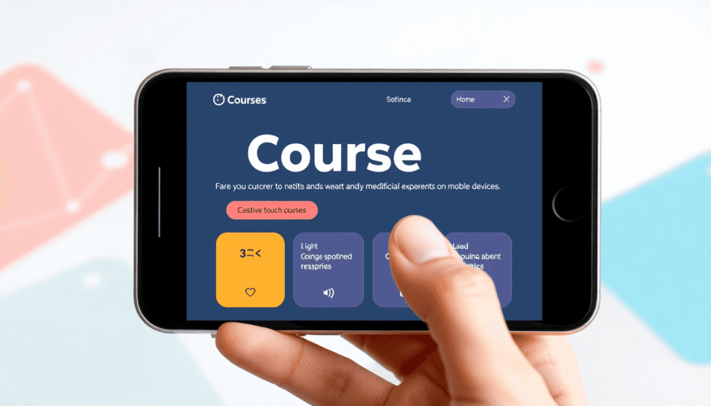
Implementing Mobile-Friendly Design with Maatos Platform
The Maatos LMS simplifies the process of building mobile-friendly course websites through its intuitive drag-and-drop builder. This feature allows you to design responsive layouts without needing extensive coding skills. By visually arranging elements, you can immediately see how your course will appear on different devices, ensuring a seamless experience for learners accessing content on smartphones or tablets.
Key features supporting mobile optimization include:
- Responsive Templates: Maatos offers pre-built templates designed to automatically adjust content layout according to screen size. These templates prioritize readability and usability, adapting navigation menus and media elements fluidly.
- Drag-and-Drop Content Blocks: Easily organize course materials into modular sections. This supports the creation of short lessons and segmented video clips that work well on smaller screens.
- Mobile Navigation Tools: The platform enables concise menu customization, letting you create clear, descriptive link text that avoids clutter. Collapsible menus and simplified navigation bars enhance user flow on mobile devices.
- Media Optimization Options: You can upload images and videos with automatic compression settings that reduce file sizes while preserving visual quality. Adding alt text fields directly in the builder supports accessibility compliance without additional effort.
- Preview Modes: Maatos lets you preview your course website in various device modes (mobile, tablet, desktop) during development. This real-time feedback helps identify layout or usability issues before publishing.
- Performance Enhancements: Built-in caching and optimized code delivery improve load speeds on mobile networks, minimizing wait times for students accessing courses remotely.
The platform’s design flexibility encourages educators to experiment with different content arrangements tailored for mobile learners. Creating an engaging mobile course site becomes straightforward when essential UX components—navigation clarity, content chunking, and media accessibility—are baked into the workflow from the start. To explore more about these features, visit the Maatos website.
Conclusion
Creating a mobile friendly course website is no longer optional but essential for reaching today’s learners effectively. Mobile optimization enhances accessibility, engagement, and convenience—key factors that influence student success.
You have seen how thoughtful design principles such as responsive layouts, content adaptation, streamlined navigation, and media optimization come together to build a seamless mobile learning experience. Testing across devices ensures that your course performs well wherever students access it.
Maatos offers a practical solution to simplify this process. Its drag-and-drop builder empowers you to:
- Design courses that look great on any screen size
- Organize materials into mobile-friendly modules
- Streamline navigation with intuitive menus
- Optimize multimedia content for faster loading and better usability
Explore Maatos to bring your course website into the mobile era. Empower your students with flexible learning anytime, anywhere. Your next step toward a truly accessible and engaging online classroom starts here.