Course landing pages are specialized web pages designed specifically to promote and convert visitors into enrolled students for both online and offline courses. These pages act as the frontline of your online course marketing efforts, offering focused information about your course and guiding potential learners toward taking decisive action, such as signing up or purchasing.
The success of a landing page hinges on its design being conversion-focused. This means every element—from headlines to calls-to-action (CTAs)—works together to turn casual visitors into committed students. A high-converting course page eliminates distractions, highlights benefits clearly, and makes enrollment an easy, compelling choice.
This article aims to guide you through the essential steps and best practices for creating high-converting course landing pages. You will learn how to craft pages that not only attract visitors but also maximize your course enrollment rates by using proven strategies in design, copywriting, multimedia integration, trust-building, and SEO optimization.
To achieve this, it’s vital to understand the specific elements of a sales page that actually convert for courses. These elements serve as the backbone of your online course marketing strategy, helping to turn visitor curiosity into actual enrollment or purchase decisions. If you’re seeking professional assistance in creating these high-converting landing pages, consider exploring our done-for-you service. We specialize in developing tailored solutions that drive results. For more information about our services, visit our services page or feel free to contact us directly.
Understanding the Purpose of Course Landing Pages
Course landing pages serve one primary objective: driving specific actions such as course enrollment, student conversion, or direct purchases. These pages are designed with a focused goal—to turn visitors into paying or registered learners by guiding them toward a desired action. This makes them distinct from general websites or blogs.
How Course Landing Pages Differ From Websites or Blogs
- Single Objective Focus: Unlike full websites that provide broad information and multiple navigation options, course landing pages center around one core purpose—converting visitors. This focus eliminates distractions and funnels user attention toward enrollment.
- Streamlined Structure: Landing pages have minimal menus or external links to keep users engaged with the course offer. This contrasts with blogs that prioritize content exploration and varied topics.
- Concise Messaging: Every element on a landing page—from headlines to images—is crafted to support conversion rather than just inform or entertain.
Role Within LMS and E-Learning Ecosystems
Within Learning Management Systems (LMS) or e-learning platforms, course landing pages act as critical marketing tools that:
- Promote individual courses or course bundles directly to targeted audiences.
- Integrate with payment gateways and registration systems for seamless student onboarding.
- Provide clear calls-to-action aligned with the platform’s enrollment processes.
- Generate data on visitor behavior, helping educators optimize marketing strategies through analytics.
These targeted marketing pages work hand-in-hand with broader digital marketing efforts like email campaigns, social media ads, and SEO strategies to increase visibility and attract qualified leads ready to take the next step.
A well-designed course landing page is not just a promotional asset; it is the conversion engine that transforms casual visitors into committed students.
To create such an effective course landing page, it’s essential to start with a clear understanding of your goals and target audience. You can begin your journey by exploring resources like this guide which provides valuable insights into crafting successful course landing pages.
Moreover, it’s important to remember that these landing pages are part of a larger ecosystem that includes essential pages every course website needs. A well-structured course website plays a crucial role in boosting student engagement and driving learning success. When students can easily find what they need and navigate content smoothly, their focus remains on learning rather than grappling with website navigation issues.
Key Elements of High-Converting Course Landing Pages
1. Conversion-Focused Design and Clear CTAs
A high-converting course landing page hinges on how effectively it directs visitors toward the desired action—typically enrolling in a course. The design must prioritize conversion optimization by making the path to sign-up clear, simple, and irresistible.
Importance of Call-to-Action (CTA) Buttons
Call-to-action (CTA) buttons are the most critical interactive elements on your page. They should be:
- Bold and prominent: Use contrasting colors that stand out from the rest of the page to draw immediate attention.
- Action-oriented: Phrases like “Enroll Now,” “Join the Course,” or “Start Learning Today” speak directly to user intent and encourage clicks.
- Benefit-driven: Adding a sense of value or urgency can boost conversions. Examples include “Get Instant Access,” “Reserve Your Spot,” or “Claim Your Discount.”
Placement Strategies for CTAs
Placement strategies for CTAs greatly influence their effectiveness:
- Position a primary CTA above the fold, so visitors see it without scrolling.
- Repeat CTAs strategically throughout longer pages—in module descriptions, after testimonials, or at the end of key sections.
- Use sticky headers or floating buttons on mobile versions to keep enrollment buttons always accessible.
Visual Cues and Avoiding Clutter
Visual cues such as arrows, whitespace around buttons, and hover animations further guide user behavior toward clicking CTAs. Avoid clutter near these buttons to prevent distractions that dilute focus.
The goal: every visitor should instinctively know where to click next without confusion. This clarity transforms casual browsers into enrolled students efficiently.
2. Engaging Headlines and Benefit-Oriented Copywriting
High-converting course landing page elements rely heavily on headlines and copywriting that resonate with your target audience. The headline is often the first thing visitors see, making it critical in capturing attention and encouraging further exploration of your course offering.
Crafting Clear and Benefit-Focused Headlines
Your headline should immediately communicate the core benefit or transformation the course offers. Avoid vague or generic phrases.
Use language that reflects the learner’s goals or pain points. For example, instead of “Learn Web Development,” try “Build Responsive Websites from Scratch in 8 Weeks.”
Short, punchy headlines work best for quick comprehension alongside conversion optimization efforts.
Subheadings can support the main headline by clarifying what the learner will achieve or how the course stands out.
Using a Conversational Tone to Connect Emotionally
Write as if you are speaking directly to a potential student. This builds trust and rapport.
Use simple words and sentences to make content approachable. Avoid jargon unless targeting a highly specialized audience.
Address common fears or doubts learners might have, such as “No prior experience needed” or “Flexible schedule for busy professionals.”
Questions in copy can engage readers: “Ready to master digital marketing and boost your career?”
Highlighting Course Outcomes and Solving Learner Challenges
Focus on the results learners can expect, rather than just listing features or topics.
Include specific outcomes like “Gain practical skills to land your first freelance project” or “Increase sales by 30% using proven strategies.”
Address common challenges your audience faces, demonstrating empathy and positioning your course as the solution.
Examples of Persuasive Copywriting for Courses
“Discover how to create stunning graphics without expensive software—perfect for beginners wanting to enhance their portfolio.”
“Transform your public speaking skills with hands-on exercises designed for nervous presenters.”
Such copy highlights benefits while addressing common barriers like cost worries or confidence issues.
Integration with Call-to-Action (CTA) Elements
Your engaging headlines and copy should naturally lead visitors toward enrollment buttons and calls-to-action. When learners clearly see how the course meets their needs, they are more likely to respond positively to CTAs designed for conversion optimization.
A well-written headline paired with persuasive copy sets the emotional tone that supports effective call-to-action placement discussed earlier, boosting clicks on enrollment buttons.
The combination of clear headlines, conversational tone, focused benefits, and problem-solving copy forms the backbone of successful high-converting course landing pages.
3. Detailed Course Information and Transparency
A high-converting course landing page relies heavily on clear, detailed information that builds confidence and reduces friction in the decision-making process. Beyond just having compelling headlines and strong calls-to-action, you must provide prospective students with a thorough understanding of what they’re signing up for.
Comprehensive Course Outlines
Visitors want to know exactly what they will learn. Break down your course syllabus into well-organized modules or lesson segments:
- List each module with a brief description of its focus.
- Highlight key skills or knowledge gained from every section.
- Use bullet points or numbered lists for easy scanning.
- Include estimated time commitments per module if possible.
This approach demonstrates transparency and shows that you value the learner’s time. The clarity helps alleviate uncertainty, making visitors more comfortable clicking those enrollment buttons. Knowing how to write a proper course description can significantly enhance this process.
Example: Instead of vague statements like “Learn digital marketing strategies,” specify:
- Module 1: Fundamentals of SEO — Techniques to improve website ranking
- Module 2: Content Marketing — Creating engaging blogs and social media posts
- Module 3: Email Campaigns — Building subscriber lists and conversion funnels
Pricing Options Clarity
Pricing is often a deal-breaker. Avoid overwhelming potential students with confusing numbers by presenting pricing plans clearly:
- Show lump sum payment amounts alongside installment options if available.
- Outline what each payment tier includes (e.g., access duration, bonus materials).
- Mention any discounts, scholarships, or refund policies upfront.
- Use tables or comparison charts for quick understanding.
Transparent pricing eliminates hesitation caused by hidden fees or unclear terms. When paired with strategically placed call-to-action buttons near pricing sections, conversion optimization improves significantly. For more insights into course pricing models that convert, you can refer to this comprehensive guide.
Why Transparency Matters for Conversion Optimization
Providing detailed course content and straightforward pricing directly supports the goal of driving enrollments. It reduces guesswork and builds trust — two critical components in convincing visitors to take action. Remember, course landing pages are designed to channel visitor attention toward those enrollment buttons; giving learners all relevant information upfront means fewer obstacles between interest and signup.
The importance of creating course pages that clearly explain value cannot be overstated; it’s a critical factor in attracting and converting learners for your online courses. Clear course syllabus information combined with transparent cost details makes your landing page one of the strongest high-converting course landing page elements you can implement. This is where effective course checkout optimization comes into play, refining the purchasing process to increase sales.
However, it’s equally important to consider the potential implications of high refund rates on your course’s reputation and profitability. Frequent online course refunds usually point to dissatisfaction with the course content or delivery, which could be mitigated by providing comprehensive information upfront. For insights on why your course refund rate may be high and how to fix it, this resource provides valuable guidance.
For further understanding on how to structure your [pricing](https://maatos.com/pricing
4. Using Multimedia Elements to Engage Visitors
High-converting course landing page elements rely heavily on visual and interactive content to capture attention and boost engagement. Videos and images serve as powerful tools for conversion optimization, helping visitors connect with your course material and encouraging them to click on enrollment buttons.
Videos for Engagement
- Course Previews: Short clips showcasing key lessons or highlights provide a sneak peek into what students can expect. These previews build curiosity and reduce uncertainty by giving a tangible sense of the course’s style and substance.
- Instructor Introduction Videos: Authentic instructor intros humanize your offering, making the learning experience more relatable. When potential students see and hear the instructor, trust increases, making them more likely to proceed with enrollment.
- Video content also supports different learning preferences, catering to those who absorb information better through auditory and visual means rather than text alone.
Images and Infographics
- Use high-quality images that reflect the course topic or target audience. Relevant visuals help break up text-heavy sections, making the page easier to scan.
- Infographics simplify complex concepts or processes related to the course curriculum. Visual breakdowns of modules or timelines make information digestible at a glance.
- Visual aids reinforce key benefits without overwhelming visitors, maintaining focus on the call-to-action.
Incorporating thoughtful multimedia elements aligns perfectly with other high-converting course landing page elements like clear calls-to-action and transparent course information. Together, these components create an immersive experience that guides visitors toward clicking those crucial enrollment buttons on your course landing pages.
5. Building Trust with Social Proof and Instructor Credentials
Trust is essential for convincing people to sign up for your course. When visitors believe in the quality of your course and the expertise of your instructor, they’re more likely to click on enrollment buttons or take other desired actions.
Student Testimonials for Courses
- Showcase authentic experiences: Use testimonials to share real stories from past students who have benefited from your course.
- Highlight specific outcomes: Focus on tangible results such as skill improvements, career advancements, or successful project completions that students achieved after taking your course.
- Use diverse formats: Appeal to different audience preferences by incorporating various types of testimonials like text quotes, video testimonials, or case studies.
- Position testimonials strategically: Place testimonials near important call-to-action areas on your landing page to reinforce decision-making at critical moments.
“Thanks to this course, I landed my dream job within three months. The practical lessons and instructor support made all the difference.” – Sarah M., Graphic Designer
Instructor Bio Credibility
- Display qualifications prominently: Make sure to showcase the academic credentials, professional certifications, industry experience, and notable achievements of your instructor.
- Humanize the instructor: Include a brief personal story or teaching philosophy that gives insight into who the instructor is as a person and helps create an emotional connection with potential students.
- Consider using video introductions: If possible, embed a short introductory video where the instructor introduces themselves directly to prospective students and outlines the benefits of taking their course.
Why These Elements Matter for High-Converting Course Landing Pages
Both social proof (through student testimonials) and instructor credibility (through bio information) address common concerns that potential learners may have. They help alleviate perceived risks by showcasing proven success stories and expert guidance.
By integrating these elements strategically into your course landing page design, you can enhance its overall effectiveness in driving conversions. This approach supports stronger calls-to-action by reassuring visitors that signing up for your course will lead to real benefits under the guidance of qualified professionals.
Make sure to incorporate these trust-building features alongside other key elements known to increase conversion rates on course landing pages. For more insights on how to build trust on a course website, creating a compelling environment that motivates users towards enrollment buttons while reinforcing your conversion optimization goals will ultimately result in higher signup numbers.
6. Clean Design and User Experience (UX) Best Practices
Creating a high-converting course landing page requires more than compelling content and persuasive CTAs. The visual structure and user experience play a critical role in guiding visitors smoothly toward the desired action—whether that’s clicking enrollment buttons or signing up for more information. Here are essential design and UX principles to keep in mind for conversion optimization on your course landing pages:
Uncluttered Layouts with Hierarchical Typography
- Simplicity drives focus. Avoid overcrowding your page with too many elements competing for attention. A clean, spacious layout helps users quickly scan the content without feeling overwhelmed.
- Use hierarchical typography to organize information clearly. Headlines should be bold and prominent, instantly conveying the main benefit or offer. Subheadings break down detailed sections such as course modules or pricing plans. Body text remains concise but informative, supporting the key messages without clutter.
- Consistent font choices and sizes reinforce a professional look while aiding readability.
- White space is your ally—it separates different sections naturally and highlights important calls-to-action.
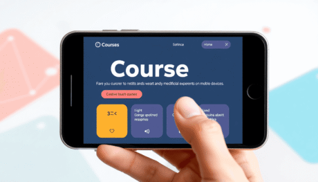
Mobile-Friendly Design for Courses
- Many prospective students access course landing pages via smartphones or tablets. Ignoring mobile responsiveness risks losing a huge portion of your traffic.
- Responsive design adapts layouts automatically to fit smaller screens without compromising usability.
- Touch-friendly buttons, especially enrollment buttons and call-to-action elements, enhance interaction on mobile devices.
- Avoid tiny fonts or cramped spacing that frustrate users trying to navigate on touchscreens.
Fast-Loading Pages for Course Landing Pages
- Page speed directly influences user experience and conversions. Slow-loading pages lead to higher bounce rates and lost enrollments.
- Optimize images and multimedia elements by compressing files without sacrificing quality.
- Minimize excessive scripts or plugins that can bog down performance.
- Use reliable hosting services tailored for fast delivery.
Incorporating these high-converting course landing page elements ensures visitors stay engaged long enough to consider enrolling. The combination of uncluttered design, clear visual hierarchy, mobile adaptability, and fast loading times creates a seamless path from interest to action on your course landing pages.
SEO Optimization Strategies for Course Landing Pages
Effective SEO for courses hinges on strategic keyword integration throughout your landing page. This begins with selecting keywords that prospective students commonly use when searching for courses in your niche. Focus on terms like “course landing pages,” “online course sign-up,” or “best [subject] course.” Incorporate these keywords naturally into:
- Headlines: Craft clear, compelling titles that include primary keywords to immediately signal relevance to search engines and visitors alike.
- Subheadings: Use secondary and long-tail keywords here to organize content and improve scan-ability.
- Body text: Integrate keywords thoughtfully within paragraphs, avoiding keyword stuffing which can harm rankings and readability.
Meta descriptions play a critical role in attracting clicks from search results. Write concise, persuasive meta descriptions that include target keywords and summarize the course benefits or unique selling points. A well-crafted meta description acts as a mini-advertisement in search listings, increasing traffic quality and quantity.
Images and multimedia often get overlooked in SEO but are vital components of course landing pages. Every image should have descriptive alt text containing relevant keywords. This practice improves accessibility for users with disabilities and boosts SEO by helping search engines understand the content of your multimedia elements. For example:
- Instead of generic alt text like “classroom photo,” use something more descriptive such as “Instructor-led advanced marketing course session” to align with your targeted keywords.
- Videos embedded in the page should have transcripts or captions optimized with relevant terms to capture additional search traffic.
Implementing these SEO strategies helps your course landing page rank higher on search engines, driving organic traffic that is already interested in what you offer. Well-optimized pages gain visibility without relying solely on paid advertising, making them an essential element of a sustainable marketing strategy for any course creator.
Additional Features That Boost Conversions
Anticipating the questions prospective students may have about your course or enrollment process is essential for creating high-converting course landing pages. A well-crafted FAQs section for courses addresses common doubts and objections upfront, reducing friction and increasing confidence in signing up.
Why Include a FAQs Section?
Handles learner objections directly: Many potential students hesitate due to uncertainties about course content, duration, pricing, or certification. Answering these concerns clearly prevents drop-offs.
Saves time for both you and the learner: Instead of contacting support repeatedly, visitors find instant answers, speeding up their decision-making.
Improves user experience: Organized information improves navigation and makes your landing page feel more trustworthy and professional.
What to Cover in Your Course FAQs
Focus on questions that learners frequently ask or that you anticipate as barriers to enrollment:
- Course prerequisites and skill level requirements
- Time commitment and schedule flexibility
- Pricing details including payment plans or refunds
- Certification validity and career benefits
- Technical requirements for online courses (platform compatibility, required devices)
- Support availability during and after the course
- Access duration to course materials post-completion
Tips for Effective FAQ Design
Use collapsible sections or accordions for a clean layout that doesn’t overwhelm visitors.
Phrase questions in the exact language your audience uses; this resonates better and feels personalized.
Link relevant FAQs to other parts of the landing page or support resources for deeper information.
Regularly update FAQs based on new student feedback or changes in course offerings.
In addition to a comprehensive FAQs section, incorporating other features such as testimonials, detailed course descriptions, and interactive elements can further enhance user engagement and conversion rates. A strategic FAQs section transforms your course landing pages into self-serving tools that reduce hesitation and build trust. It acts as a silent salesperson, answering objections before they arise and making the enrollment process smoother for everyone involved.