


Most course creators open their analytics for the first time, see a number go up, feel briefly pleased, and close the tab again. Nothing changes in the course. Nothing changes in the sales page. The number was interesting; it just wasn’t useful.
Course website analytics only earns its keep when a number is attached to a decision. So this guide is organized that way: for every metric, what it means, what a normal-looking value is, and what you actually do on Monday morning when it looks wrong. Along the way we’ll deal with two things almost nobody writing about this mentions — the fact that your website analytics and your student data live in two separate systems that don’t talk to each other, and the fact that if your learners are in Europe, a meaningful slice of your traffic data is Google’s estimate rather than a headcount.
You don’t need to become an analyst. You need about twenty minutes a week and the confidence to ignore most of the dashboard.
Your course website has two analytics systems, and they don’t talk
A course website measures itself in two separate places, and confusing them is the single most common reason creators feel lost in their own data.
Web analytics watches the public part: your homepage, your course sales pages, your blog, your checkout. It knows how someone arrived, what they read, and whether they bought. It is anonymous by design and it stops being useful the moment somebody logs in.
Learning data lives inside your LMS: who enrolled, which lessons they finished, where they stalled, what they scored. It knows exactly who did what — but it has no idea that Anna found you through a LinkedIn post six weeks ago.
Between them sits a seam. Google Analytics can tell you 4% of your sales-page visitors bought. Your course platform can tell you 38% of buyers finished. Neither can tell you whether the people who came from LinkedIn finish more often than the people who came from search — even though that’s the question that would actually change what you do next.
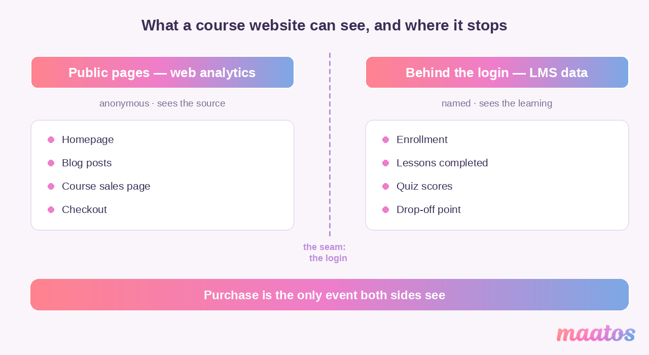
You bridge the seam manually, and it’s easier than it sounds: tag your marketing links so the source survives to the checkout, then once a quarter export your student list and compare it against where those sales came from. Our simple UTM tracking setup for course sales covers the tagging side. The rest of this guide takes each system in turn — web first, because that’s where the leaks usually are.
How many people are actually finding you?
Traffic is the foundation of course website analytics: it tells you the size of the pool everything else is a percentage of. If your conversion rate looks terrible on 40 visitors a month, you don’t have a conversion problem — you have an audience problem, and no amount of button-color testing will fix it.
Is the raw visitor count worth watching?
Only as a trend, and only monthly. A single week’s visitor count tells you almost nothing; three months of it tells you whether anything you’re doing is working.
Watch it for three things. Reach — is the pool growing at all, or have you been busy without being visible? Response — did the webinar, the guest post, the newsletter actually move the line, and by how much? And load — if you’re about to run a launch to a list of 5,000, it’s worth knowing your site normally serves 300 people a month before you find out the hard way. (On a hosted platform that’s somebody else’s problem; on Maatos, hosting is included in every plan, so a traffic spike isn’t a bill you have to think about. Worth checking what your setup covers before a launch, whatever you’re on — our pricing page spells out what’s bundled on ours.)
What the visitor count can’t tell you is whether any of those people were the right people. That’s what the next two sections are for.
New versus returning visitors
The split between new and returning visitors is the fastest read on whether you have a discovery problem or a trust problem.
A site that is almost all new visitors is being found but not remembered — people arrive, look, and never think about you again. That’s usually a content problem: you answered a question and gave them no reason to come back. A site that is almost all returning visitors has the opposite issue: a small loyal audience and no new blood, which feels lovely and quietly caps your revenue.
There’s no golden ratio, and anyone who gives you one is guessing. What matters is the direction. If returning visitors are growing as a share of the total while the total also grows, you’re building something. If returning visitors are growing because new visitors are collapsing, you’re coasting.
Where your visitors actually come from
Traffic sources tell you which of your efforts deserve more of your time, and they’re the only marketing metric most course creators genuinely need.
Organic search is people who typed a problem into Google and landed on you. It compounds, it’s free, and it takes months — which is exactly why it’s worth starting before you need it. Direct is people typing your URL or using a bookmark; it’s your brand, your podcast mentions, your business cards, and anything else Google can’t attribute properly. Referral is links from other sites — a partner’s blog, a forum thread, a directory. Social is what it says, and it is almost always smaller than it feels while you’re posting.
Two habits make this section actually useful. First, look at sources per conversion, not per visit: 800 visits from social that buy nothing are worth less than 40 from a niche newsletter that buy three times. Second, tag anything you send out yourself, or half your best traffic will pile up in “direct” and you’ll never know which email did it.
Are they engaging, or just passing through?
Engagement metrics tell you whether people are reading your site or bouncing off it, and they are the cheapest early warning you have.
Pages per session and average session duration
Pages per session is how many pages a typical visit touches. One page means they got what they needed and left, or they got nothing and left — and the number alone can’t tell you which. Average session duration is how long a visit lasts. Longer usually means they’re reading rather than scanning.
Both are soft numbers. A blog post that answers a question perfectly in ninety seconds is a success with a “bad” session duration. Don’t chase either metric on its own.
How to read those two numbers together
Read them as a pair and they get much more honest.
High pages and long sessions on your course sales page usually means genuine interest with something in the way — people are hunting for information they can’t find, often the price or what’s actually included. Low pages and short sessions on a page that ranks well usually means an intent mismatch: the search promised one thing, the page delivered another. Long sessions with a single page view are often just fine — that’s someone reading.
The useful move is to look at the two numbers only on the four or five pages that matter (homepage, main sales page, pricing, top blog post) and ignore them everywhere else.
Bounce rate and exit rate: where the early warnings show up
Bounce rate is the share of visits that ended on the page they started on. Exit rate is the share of views of a specific page that were the last page of the visit — so it applies even to people who arrived elsewhere and wandered in.
The difference matters because they point at different problems. A high bounce rate on your homepage is a first-impressions problem. A high exit rate deep in a funnel is a friction problem, and it’s much more expensive.
Three patterns worth acting on:
- High bounce on a page that ranks well. The title is promising something the page doesn’t deliver. Fix the page or fix the promise.
- High exit on the course overview page. People understood the course well enough to decide against it, or not well enough to decide at all. Usually it’s a missing price, a missing “who this is for”, or a missing sense of what they’ll be able to do afterwards.
- High exit inside a lesson or a quiz. That’s a course problem, not a website problem. Check the difficulty and the instructions before you touch anything else — building quizzes that improve completion rather than anxiety goes into what usually causes it.
What the course itself tells you
Course interaction metrics are where the real story lives, because they measure the thing you actually sold. This is your LMS’s data, not your web analytics, and it’s the half most creators under-use.
Enrollments
Enrollment count is the appeal of the offer multiplied by the reach of the marketing, and it’s the one number you should never look at in isolation. A dip after a good month usually means one channel went quiet, not that the course got worse. Before you rewrite the sales page, check whether traffic fell — if it didn’t, the page really is the problem, and course pricing models that convert is a good place to start on the offer itself.
Completion rate — and what “normal” really looks like
Completion rate is the percentage of enrolled students who finish, and it is the most misread number in online education because almost everyone compares themselves to the wrong benchmark.
The gloomy “hardly anyone finishes online courses” figure comes from open marketplaces and MOOCs, where people enroll on impulse during a heavy discount and never intended to finish. Katy Jordan’s peer-reviewed survey of MOOC enrollment found that the average course drew around 43,000 registrations and was completed by roughly 6.5% of them — that’s where the scary number ultimately traces back to, and it is not your world. Ruzuku published benchmarks drawn from 1.3 million enrollments on their own platform that separate the formats properly: roughly 3–15% on marketplaces and MOOCs, 30–45% for self-paced courses on an independent site, and 65–85% for cohort courses with live sessions. They also report that courses with discussion prompts sitting inside each lesson completed at 51% against 37% without — a fourteen-point swing from one structural choice.
So before you panic about a 40% completion rate on a self-paced course, notice that you’re at the top of the normal band for that format. And if you want the number higher, the evidence points at structure rather than production value: shorter lessons, something to do in each one, and a reason to talk to other students. Our piece on drip, cohort and self-paced delivery walks through which format suits which subject.
Time spent on course content
Time-on-content tells you where the course is heavy, and it’s most useful compared against your own estimate. If you planned a module as twenty minutes and the median student spends fifty, something in there is harder than you think — usually an instruction, occasionally a genuinely difficult idea. If they spend six minutes on your forty-minute module, they skipped it, and you should find out whether that’s because it’s optional or because it’s dull.
Unusually short and unusually long are both signals. Only the middle is quiet.
Assignment submissions and quiz attempts
Submissions and quiz attempts measure commitment rather than consumption, which makes them the best leading indicator you have. Someone who watches every video and submits nothing is drifting; someone who retakes a quiz three times is engaged and struggling, which is a completely different intervention.
Watch the first assignment above all others. If a big share of students never submit assignment one, the problem isn’t the assignment — it’s that nothing in the first week gave them a reason to show up.
Watching how people move around the site
Behavior analysis shows you the route people take rather than the destinations they reach, and it explains a lot of otherwise baffling drop-offs.
Click paths: the routes people actually take
Click path tracking records the sequence of pages in a visit. What you’re looking for is the gap between the journey you designed and the journey people take.
It reliably surfaces three things: the route your best buyers take (often much shorter than the one you built), the place where people loop — visiting the same two pages back and forth, which almost always means an unanswered question — and the pages that are dead ends nobody escapes from. When you see a loop between “course overview” and “pricing”, you’ve found a missing sentence, not a missing feature.
Heatmaps and scroll depth
Heatmaps color-code where people click, hover and tap; scroll depth shows how far down they get before they leave or act.
They’re worth setting up for two weeks on your two most important pages and then turning off again. In those two weeks they’ll usually tell you something you’d never have guessed: that people click your non-clickable section headings, that your enroll button sits just below the point where most visitors stop scrolling, or that the testimonial you agonized over is never seen at all. That last one is common enough to be worth checking on any page you’ve redesigned — our notes on designing a course website homepage cover what usually deserves the space above the fold.
Turning behavior into changes
Behavioral data is only worth collecting if you change something, so give yourself a rule: one change per finding, then wait two weeks and look again.
The changes worth making are usually small. Move the sign-up button above the scroll cliff. Cut the menu down to the four things people actually click. Put the answer people were looping to find on the first page instead of the second. Shorten a page that nobody reads past the halfway mark rather than adding to it. And when a change makes things worse, put it back — that’s data too.
Where the money leaks: from visitor to paying student
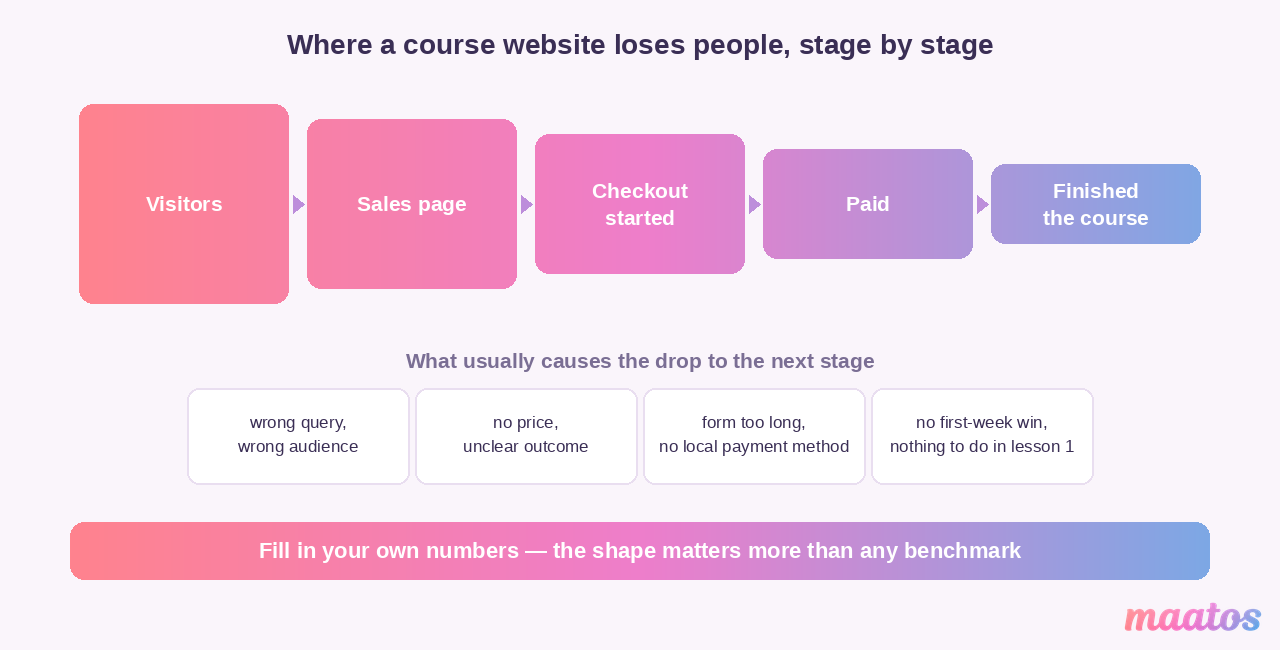
Conversion metrics measure the handful of moments where interest turns into money, and they are the fastest place on a course website to find real revenue.
Three numbers do the work. Sign-up conversion rate is the share of visitors who register or start a free trial. Purchase conversion rate is the share who complete payment once they’ve started. And drop-off by step is where in the sequence people quit — the one that actually tells you what to fix.
Uteach’s round-up of course performance metrics puts typical website conversion in the 3–7% range depending on the industry, which is a reasonable sanity check rather than a target. Your own trend matters more than anyone’s benchmark.
The leaks are boringly consistent across course websites, which is good news, because it means the fixes are known:
The form asks for too much. Every optional field costs you people. Name, email, password. Company size can wait until they’re a customer.
The price is a surprise, or it’s in the wrong currency. A learner in Dublin looking at a dollar price with no VAT line is doing mental arithmetic instead of buying. Show the price early, show it in a currency they recognize, and be explicit about tax.
The payment method isn’t one they use. Cards are not universal. iDEAL in the Netherlands, Bancontact in Belgium, SEPA direct debit for subscriptions, Apple Pay and Google Pay everywhere — a European checkout that only takes cards is quietly turning people away. Maatos connects to Stripe and Mollie precisely so the local methods are available without you building anything.
Nothing on the page says you’re real. Reviews, a named instructor, a refund policy in plain language, a visible way to ask a question. Trust is a conversion feature.
The route from “interested” to “buy” has a detour in it. Every extra page between the course description and the checkout costs you a slice of the people on it.
One more thing that belongs here and rarely gets measured: refund rate. It won’t appear in your web analytics at all — it lives in Stripe or Mollie. A refund rate creeping upward is the single loudest signal that your sales page is promising something the course doesn’t deliver, and it’s worth a monthly glance even when everything else looks healthy.
Everything breaks when the site is slow
Technical performance is a course website metric because a slow, broken or unreadable page loses students before any of the other numbers get a chance to matter.
Page load and responsiveness. Google’s Core Web Vitals are the practical shorthand here, and one of them changed recently enough to catch people out: Interaction to Next Paint (INP) replaced First Input Delay in March 2024, and it measures how sluggish your page feels across all interactions rather than just the first one. Along with Largest Contentful Paint (how fast the main content appears) and Cumulative Layout Shift (how much the page jumps around while loading), it’s the set worth watching. You can read yours for free in Google Search Console, and on a course site the usual culprits are unoptimized images and video players loading on pages nobody watches video on.
Mobile. Many of your learners will discover you on a phone even if they end up studying on a laptop. That means the sales page has to work on a small screen even more than the lessons do. Check the enroll button with a thumb, not a mouse.
Devices and browsers. Your analytics will tell you the split. You’re not looking for perfection here — you’re looking for the one combination where something is broken. An enroll button that fails on iOS Safari costs you every iPhone visitor, and it shows up in the data as nothing more than a slightly disappointing conversion rate.
The workflow that makes this manageable: check Core Web Vitals in Search Console once a month, segment your conversion rate by device once a quarter, and fix whatever affects the biggest group first. Everything else can wait.
Ask them: ratings, reviews and surveys
Quantitative data tells you what happened; only your students can tell you why, and the “why” is where the improvements are.
Ratings and reviews
Course ratings do three jobs at once. They build trust for the next buyer, which makes them a conversion asset as much as a feedback channel. They give you an honest quality read that your own enthusiasm can’t. And they provide social proof — visible evidence that other people took this seriously.
Collect them at the moment of completion, when goodwill peaks. And publish them, including the three-star ones: a page of unbroken five-star reviews reads as fake to anyone over the age of twelve.
Surveys, for the things numbers can’t reach
A short survey answers questions your dashboard structurally cannot: whether the material was clear, whether the navigation made sense, whether they felt supported when they got stuck, and — the most valuable question of all — what nearly stopped them buying.
Keep it to five questions, ask one open-ended one, and send it twice: once mid-course while the frustration is fresh, once at the end. Our list of 22 questions to get feedback from your users has ready-made wording if you’d rather not start from a blank page.
Closing the loop
Feedback that doesn’t change anything trains people to stop giving it. So the loop has to close visibly: collect it, group it, act on the thing that came up three times, and tell the people who mentioned it that you did.
That last step is the one everybody skips and it’s the one that turns a student into an advocate. “You said module 3 was confusing, so I’ve re-recorded it” is worth more than any testimonial request you could send.
The consent problem nobody warns European course creators about
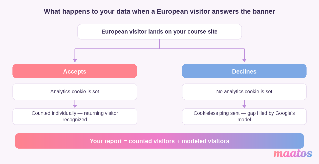
If any meaningful share of your learners are in Europe, your traffic numbers are partly an estimate rather than a headcount — and that changes how you should read them.
Here’s the mechanism, straight from Google’s own documentation. Analytics cookies need consent, so a cookie banner sits between your visitor and your data. When a visitor declines, your banner passes analytics_storage='denied' to Google’s consent mode, and at that point Google Analytics writes no analytics cookies at all. It still receives a cookieless ping — an anonymous, non-identifiable event — and it uses those pings for modeling: filling the gap in your reports with a statistical estimate of what the declining visitors probably did.
None of this makes your data useless. It makes it a different kind of data, and there are three practical consequences worth internalizing.
Trends beat absolute numbers. If the same modeling applies month to month, a 30% rise is still a 30% rise. But “we had exactly 1,412 visitors” is a sentence you should stop saying.
Returning-visitor data suffers most. Recognizing somebody as a returning visitor requires a cookie. No cookie, no recognition — so your “new vs returning” split skews toward new in exactly the markets where you’re building loyalty.
Your banner design is now a data decision. A banner that buries “accept” behind three clicks protects nobody and costs you your own numbers. One that pretends to offer a choice while pre-ticking everything is a compliance problem. Build a clear one, and get the wording checked by someone qualified rather than copying a competitor’s.
There’s a second layer if you also advertise. Since Google’s consent mode update for visitors in the European Economic Area, two extra signals — ad_user_data and ad_personalization — have to be passed through as well if you want to keep using measurement, remarketing and personalized advertising with Google’s ad products. Most of the well-known consent banner tools handle this for you automatically; if you built your banner yourself, this is the thing most likely to be quietly broken.
And the option nobody mentions: you can sidestep most of this by not using cookie-based analytics at all. More on that below.
(One caveat, stated plainly because this is the kind of topic where confident blog posts do damage: this is a description of how the tooling behaves, not legal advice. Consent rules and their enforcement differ by country, and if the answer matters to your business, ask a professional in your jurisdiction.)
Don’t send your students’ names to Google
The moment somebody logs in, your analytics setup can start quietly leaking personal data — and it’s a self-inflicted wound that’s easy to avoid once you know to look.
The mechanism is page URLs. Google’s tag automatically passes the current URL and page title, and Google’s own guidance is explicit that personally identifiable information often ends up in those URLs by accident and that their contracts prohibit sending it. If your member area produces addresses like /dashboard/anna.smit@example.com/module-2/, or a form submits by GET so the email lands in the query string, you are sending student identities to a third party. That’s a data protection problem and a terms-of-service problem at the same time.
Three things to check this week:
- Look at your own logged-in URLs. If a name, an email address or a raw student ID appears in the address bar, change the URL structure or exclude those pages from tracking entirely.
- Check your forms use POST, not GET. GET puts every field into the URL.
- Ask whether you need web analytics behind the login at all. Usually you don’t. Your LMS already knows who’s doing what, more accurately and without involving anyone else. Restricting your web analytics to the public pages is often the cleanest fix, and it makes the public numbers less noisy too.
Which analytics tool should you actually use?
There is no single right answer, but there are three sensible setups, and most course creators need exactly two of them.
Google Analytics 4
GA4 is the default: free, comprehensive, and the thing every guide and freelancer already knows. Worth knowing that it is genuinely a different product from the Universal Analytics most older tutorials describe — standard UA properties stopped processing data on 1 July 2023, and GA4 is event-based rather than session-based, which is why old advice about “goals” and “views” no longer maps onto anything.
Use it for acquisition — which channels, which campaigns, which pages bring people who buy. That’s where it’s strongest. Pair it with Google Search Console, which is free, requires no consent banner because it reports on Google’s side rather than tracking your visitors, and answers the question GA4 can’t: what people actually searched before they clicked.
Privacy-first alternatives
Plausible, Fathom, Simple Analytics and self-hosted Matomo are all built to measure a website without cookies and without collecting personal data. Their appeal for a European course creator is direct: a much simpler compliance story, no modeled gap in the numbers, and — depending on your configuration and your jurisdiction — often no cookie banner requirement at all. Their vendors make that claim confidently; whether it applies to your setup is a question for your own advisor, not a blog post.
The trade-offs are real. You get less depth, you lose the native tie-in to Google Ads, and the paid ones carry a modest monthly fee where GA4 is free. What you get back is a dashboard you can read in ninety seconds and numbers that are actual counts.
For a lot of course creators this is genuinely the better choice, and it’s underrated because the people writing about analytics are mostly writing from a US market where consent isn’t part of the picture.
Your LMS’s own numbers
Whatever your platform, its built-in reporting is the only place the learning data exists — progress, completion, quiz results, where people stall. Nothing external can reconstruct that. This is the half of the picture our companion piece on the analytics dashboard every course creator needs is about, and it’s where you should spend most of your attention once the site is converting.
If you’re still choosing a platform, this is worth weighing properly: what an LMS is and what it should do for you covers the basics, and open-source versus SaaS course platforms covers the bigger trade-off underneath it. One thing to check before you commit, because it bites people later: whether you can export your student and sales data. Analytics you can’t take with you isn’t really yours — a point we make at more length in the course platform mistake that quietly kills sales.
Heatmaps, occasionally
Heatmapping tools sit outside all three categories: install one for two weeks when you’re redesigning a page, learn what you learn, then remove it. Left running permanently they slow your site down and add another consent line for no ongoing benefit.
What you get on a Maatos site
Since we build course platforms for a living, it’s fair to say plainly what Maatos does and doesn’t give you here — and to be more careful about it than most vendors are.
Maatos is built to connect to the analytics tools rather than replace them: every plan is prepared to integrate with Google Analytics and Google Search Console alongside your email marketing tools, and Yoast is built in for the SEO side. On the learning side, student management gives you a single overview of your participants where you can track progress and see where students get stuck. Payments run through your own Stripe or Mollie account, which means the revenue, refund and payment-method data stays in a system you control rather than a platform ledger. And on the Complete plan you get the conversion tooling that this whole article is ultimately about: sales funnels, optimized checkout pages, order bumps, upsells and A/B testing.
What we don’t ship is a built-in click-map or heatmap product — for that you’d add one of the tools above, which is exactly what we’d recommend anyway. And because hosting, unlimited video storage and unlimited students are included on every plan, the technical-performance section of this article is largely somebody else’s problem: ours.
If you’d rather not assemble any of this yourself, our done-for-you service sets the site up with the tracking already wired in, and the wider services page covers what else we can take off your plate. There are real examples of what creators have built on our cases page, and if you’re weighing us against a community-first platform, we’ve written an honest Maatos versus Skool comparison.
The numbers that look important and aren’t
Some metrics exist mainly to make dashboards look busy, and knowing which ones lets you ignore about 80% of what you’re shown.
Total page views across the whole site. It goes up when you publish, it goes up when a bot visits, and it never once told anybody what to do.
Average time on site, sitewide. Averaged across a five-second bounce and a forty-minute reading session, it describes nobody.
Social followers. Unless they’re clicking through, they’re a number you rent from someone else.
Email list size on its own. Ten thousand subscribers with a 2% open rate is a smaller asset than eight hundred with a 45% open rate — fewer people are reading, whatever the headline number says.
Anything you look at more than once a week. If a number can’t plausibly change enough in seven days to alter a decision, checking it daily is a habit, not an analysis. There’s more on this distinction in student engagement metrics that matter, not vanity.
A review rhythm you’ll actually keep
The reason most course analytics go unused isn’t the data — it’s the absence of a habit. Here’s a rhythm that takes about twenty minutes a week and turns each number into a decision.
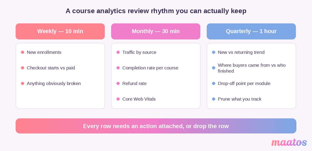
Weekly, ten minutes. New enrollments, checkout starts against completed payments, and a glance at whether anything obviously broke. You’re looking for step-changes, not trends. If checkout starts are healthy and payments aren’t, stop everything and test your own checkout on a phone.
Monthly, half an hour. Traffic by source, completion rate per course, refund rate, and Core Web Vitals in Search Console. This is where you decide what to do more of. One decision per month is plenty.
Quarterly, an hour. The new-versus-returning trend, the manual join between where buyers came from and who actually finished, the drop-off point in each course, and a prune of anything you’re tracking but never look at.
The compounding effect of this is the whole point. Fixing the drop-off in module two lifts completion, which produces better testimonials, which lifts conversion on the sales page, which means the same traffic earns more. Smoothing the checkout raises revenue without a single extra visitor. Fixing the slow page helps every one of those at once. None of it requires more traffic — it requires noticing.
Frequently asked questions
What analytics should a course website track?
Track five things and ignore the rest: where your visitors come from, how many of them start checkout, how many finish paying, how many students complete the course, and your refund rate. Everything else is either supporting detail or decoration.
Is Google Analytics enough for a course website?
No, and not because it’s bad. GA4 measures your public pages well but goes largely blind once a student logs in, so it can’t tell you anything about progress, completion or where people stall. You need your LMS’s own reporting alongside it — and if you accept payments, your Stripe or Mollie dashboard for refunds and failed charges.
Do I need a cookie banner for course website analytics?
If you use cookie-based analytics such as Google Analytics and you have visitors in the EU or UK, yes. If you use a cookieless, privacy-first tool, the vendors position it as consent-banner-free, but whether that applies depends on your configuration and jurisdiction — worth a short conversation with someone qualified rather than a guess.
Why don’t my analytics numbers match my sales numbers?
Because they’re counting different things. Ad blockers, declined cookie banners and Google’s modeled data all mean web analytics undercounts and estimates, while your payment processor counts actual transactions. When the two disagree, your payment processor is right. Use analytics for direction and your payment data for facts.
What is a good conversion rate for an online course?
Typical website conversion sits somewhere around 3–7% depending on the industry, but the benchmark matters far less than your own trend. A course selling at €500 converting at 1.5% to a well-qualified audience beats a €29 course converting at 8%.
What is a good completion rate for an online course?
It depends entirely on format. Roughly 3–15% on open marketplaces, 30–45% for self-paced courses on your own site, and 65–85% for cohort courses with live sessions, based on Ruzuku’s platform data. Compare yourself to your format, not to the headline MOOC statistic.
How often should I check my course website analytics?
Ten minutes weekly for the things that can break, half an hour monthly for the things that trend, and an hour quarterly for the bigger picture. Checking daily produces anxiety, not insight.
Can I see which marketing channel produces students who actually finish?
Not automatically — that’s the seam between web analytics and LMS data. You bridge it manually: tag your campaign links so the source is recorded at purchase, then once a quarter compare that list against your completion data. It’s half an hour of spreadsheet work and it’s usually the most surprising thing you’ll learn all quarter.
Start with the one number that’s broken
You don’t need a dashboard. You need to find the single worst leak and fix it, then find the next one.
So pick one thing this week. Check your own checkout on a phone. Look at whether your logged-in URLs contain anybody’s email address. Compare your completion rate to the benchmark for your format rather than the scary one. Any of those is worth more than another month of watching a visitor count go up and down.
And if the reason you haven’t done any of this is that your course lives somewhere that won’t show you the numbers — or won’t let you take them with you — that’s the thing to fix first. Try Maatos free for 30 days and build a course website where the analytics, the payments and the student data are all in your own hands. Every plan includes hosting, unlimited video and unlimited students, and if you’d like a hand deciding what to measure, just ask us — we’ve been helping instructors work this out since 2019. You’ll find more on the technical side over in Build Course Website.